Next Stop
Travel app · from our videos on X
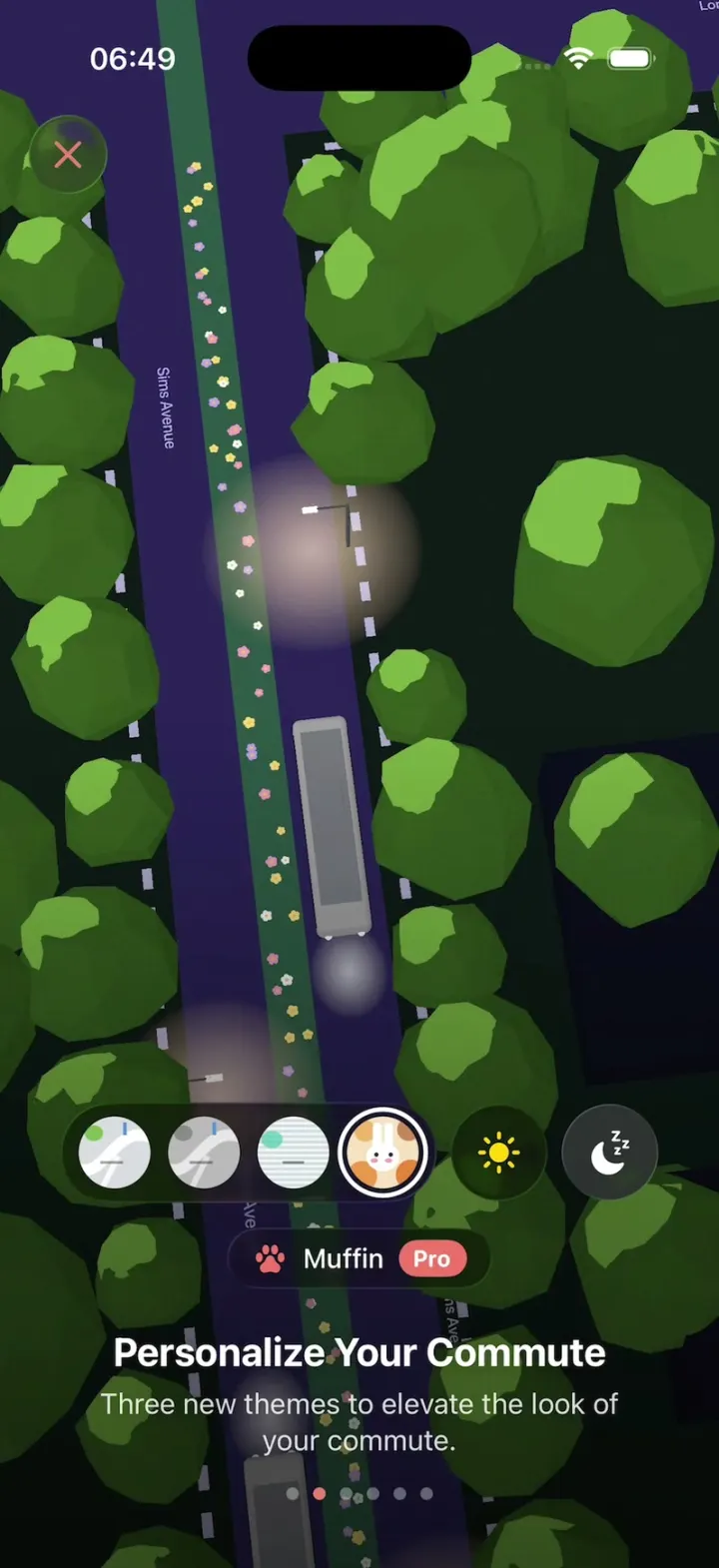
Next Stop is the what's-new onboarding of a bus app, floating over a live 3D night map of Sims Avenue: low-poly trees, warm glowing street lamps and buses driving the whole time. A welcome page cycles greetings in different languages, then each page glides the camera somewhere new. Switch the map between Classic, Monochrome, Dithered and the cartoon Muffin theme (or flip it to daytime), tap the bell on your bus to get a Lock Screen Live Activity and a 'Get off at the next stop' alert, and flip through Lock Screen cards and home screen widgets. It ends on a folded paper letter that opens up and signs itself.
- iPhone · Swift
- Built in 1 prompt
- Free to remix
Remix copies the working app into your account for free, exactly as we built it. It runs in Vibecode's cloud iOS simulator, in your browser.
Watch the video on X@ios_app_builder · Nov 16, 2026The prompt that builds it
We built Next Stop in one prompt. Paste it into a new app to build your own copy, or change it first.
Prompt · 2,589 words
[image attached][image attached][image attached][image attached][image attached][image attached][image attached][image attached][image attached][image attached][image attached][image attached][image attached][image attached][image attached]
Download/reference the app shown in this post and clone it exactly, including the iPhone visual design, layout, interactions, animations, typography, spacing, and all visible states. Make it functional and runnable in the simulator. Match the reference as closely as possible and include any interaction shown in the source. Reference: https://x.com/spottedinprod/status/2122149570834833417. The 15 attached screenshots are frames of the 20-second video, in order (t = 0.5, 1.6, 2.3, 2.6, 3.0, 5.0, 6.5, 7.25, 8.25, 9.25, 10.75, 14.1, 15.0, 16.5, 18.6 s). Read every one of them before writing code.

Build a native SwiftUI iOS app named Next Stop using Opus 5.5. The original is the "What's new in Next Stop 3.1" onboarding of a Singapore bus app: a full-screen live 3D night map of a street (low-poly round trees, glowing warm street lamps, buses driving along the road) sits behind every page, and a paged onboarding floats over it. Do NOT put a fake handset frame inside the actual app; the simulator provides that. Use realistic deterministic fixture data, no permissions, no backend, no network. Do not publish externally.

THE 3D MAP (SceneKit, the heart of the app; it fills the whole screen behind every page, edge to edge, under the status bar)
- A night scene seen from above with a slightly tilted perspective camera (about 15-25 degrees off straight down), road running almost vertically (tilted a few degrees, top-left to bottom-right) like the screenshots.
- Ground: very dark green-black (#0E1A17). Main road "Sims Avenue": wide dark grey asphalt (#3A3D45), with street names drawn flat on the road in small grey text ("Sims Avenue", "Sims Avenue Park Connector") rotated along the road. Side streets cross it at right angles. Sidewalk/kerb edges are dashed lines of light grey blocks (#9A9CA3) along each road edge (the white dashes in the screenshots).
- Trees: many low-poly rounded trees (faceted icosphere crowns, flat-shaded, olive green #5E8A47 with darker facets #3F6633, short trunk) lining both sides of every road, different sizes, crowns big enough to overhang the road edge.
- Street lamps: thin poles at the kerb with a warm glowing pool of light on the ground under each (soft radial glow, #F5D9B8 at ~60% fading to transparent, ~70 pt radius). They must read as glowing spots in the dark, exactly like the screenshots.
- Buses: 2-3 white/light grey box buses (rounded rectangle body #D9D9D9, darker roof panel, two tiny white headlights glowing at the front) driving along the road at a steady pace, looping forever. Animate continuously at 60 fps.
- A few dark building blocks (#1A2422) fill the spaces between side streets.
- The map keeps running behind every onboarding page. Each page sets its own camera pose and the camera glides between poses (1.2 s ease-in-out): page 1-3 camera straight along Sims Avenue; page 4 the camera swoops: it rotates about 40 degrees and lowers toward a diagonal road with a bus, then rotates back to a top-down straight view of the road with a bus heading up (see t = 9.25 and 10.75); page 5 pans to a busier junction with several buses; page 6 rotates to a diagonal view of a wide road; page 7 (letter) slowly drifts.

THEMES (one value drives the whole map, the X button tint and the page-dot accent)
- Classic (default): as above. Accent cyan #3FC1E0 (X icon and active page dot).
- Monochrome (Pro): everything greyscale: trees mid grey #6E6E6E with darker facets, road #6B6B6B, ground #1E1E1E, buses light grey, lamps still warm. Accent white.
- Dithered (Pro): trees deep teal green #2F7A5C with an ordered-dither / halftone dot texture on every surface, road slate blue-grey #3C4A55, ground #0F1C1F. Accent teal #3FC1A8.
- Muffin (Pro): cute cartoon look: road deep indigo #2B2459, ground #0D1A16, trees brighter green #5C9A3C with lighter crescent highlights #8BC34A, little pastel flowers (white, lilac, pink, yellow tiny 5-petal sprites) scattered down the middle of the road, one bus turns bright blue #4A90E2. Accent coral #F2786A (X icon, page dot, Done button, Pro badges).
- Switching theme cross-fades the map's colours over 0.5 s; the camera and buses keep moving.
- Once Muffin is chosen it stays for all later pages (as in the video).

OVERLAY CHROME (all pages)
- Close button top-left (x 16, y 62): 44 pt circle of dark frosted glass (white 12% fill, ultraThinMaterial), an X icon in the theme accent colour.
- Page dots: 6 small dots centred near the bottom (y about 22 pt above the home indicator), inactive white 35%, active = theme accent. Pages 2-7 own the 6 dots.
- Text: SF Pro, white. Title 22 pt bold, centered. Body 16 pt regular, white 85%, centered, 2-3 lines, 24 pt side margins. Text block sits near the bottom over a soft dark gradient (black 0 to 60% from the middle down) so it reads on the map.
- Pages 2-7 are a horizontal pager: swipe left/right to change page; ALSO tapping anywhere on the title/body text block advances to the next page (and tapping the left 25% of that text block goes back). The text block slides horizontally between pages (old text slides out left, new slides in from the right, 0.45 s spring) while the map camera glides behind.

PAGE 1 - WELCOME (t 0-2.3)
- Top 60% of the screen: a collage wall of rounded cards (corner radius 22, 10 pt gaps) that drifts slowly left forever (about 8 pt/s), behind a fade into the dark map at its bottom edge. Cards, drawn in SwiftUI (no images needed): a red/green/navy striped card with big white Korean letters "해요" and small white flowers; a light-mode 3D map card labelled "Muffin" bottom-left with a purple route and a yellow bus and a capsule label "124" (purple) + "4m" (orange); a light map card labelled "Classic" with a green/white bus on a purple route and "124" + "3m" labels; a black widget card with three big pills stacked "106" (teal #1E7F75), "190" (purple #7A2E9E), "133" (purple) and a green "Arr" cut off at the right edge; a dark card with purple pills "124" and "111" with small grey numbers "1 5" and "4 12"; a dark map card with a red route and a bus chip "19".
- Big headline centred at y about 68%: "こんにちは" in a heavy rounded font, silver/chrome glass look (white-to-grey gradient fill, subtle inner shadow). At t 1.1 it changes to "안녕하세요" with a blur cross-fade (0.4 s). Keep cycling greetings every 1.2 s: こんにちは, 안녕하세요, Hello, 你好, Selamat datang.
- Below: "Welcome! Let's get to know what's new in Next Stop 3.1." (17 pt, white 90%, centered, 2 lines).
- Button "Get on board": a wide glass capsule (230x60 pt, white 14% fill + material, white 17 pt semibold label) at y about 89%. Tapping it cross-dissolves the whole welcome page (collage, headline, button) into page 2 over 0.5 s while the map stays.

PAGE 2 - "See Where Your Bus Is"
- Capsule chip above the title: glass pill with a cyan route icon (an S-shaped path with two dots, SF Symbol "point.topleft.down.to.point.bottomright.curvepath") and "Interpolation On" (13 pt).
- Title "See Where Your Bus Is". Body "We take LTA's live bus positions and routes, then chart each bus's likely path and pace in real time."
- Below: a full-width glass row (radius 22, height 56): the route icon + "Bus Interpolation" left, an iOS toggle right, ON, tinted #2AA8D8. Toggling it off makes the buses jump stop to stop instead of gliding, and the chip reads "Interpolation Off".

PAGE 3 - "Personalize Your Commute"
- Body "Three new themes to elevate the look of your commute."
- Above the title: a centred row of controls: a dark glass capsule holding 4 circular theme thumbnails (40 pt each: Classic = light grey map swirl, Monochrome = grey, Dithered = pale horizontal stripes, Muffin = an orange-and-cream cartoon bunny pattern), the selected one has a white ring; then two separate 48 pt glass circle buttons: a yellow sun (light) and a white crescent moon with "z z" (dark, selected). Under the row, a small glass pill naming the theme with its icon: "Classic" (blue map icon), "Monochrome" + grey "Pro" badge (half-filled circle icon), "Dithered" + "Pro" (dot grid icon), "Muffin" + coral "Pro" badge (paw icon). Tapping a thumbnail switches the map theme live (see THEMES) and the pill label. The sun button switches the map to a daytime palette (light grey roads, bright trees, no lamp glow); the moon returns to night.
- In the video the theme goes Classic -> Monochrome (t 6.0) -> Dithered (t 6.9) -> Muffin (t 7.9), then the page advances.

PAGE 4 - "Know When to Get Off" + coral "Pro" badge
- Body "Tap the bell on your bus. We'll ping you on your Lock Screen before your stop."
- Above the title: a dark glass card (full width minus 24, radius 22, height 72): a teal rounded square badge "13" (white bold), then "Aft Lor G Telok Kurau" (16 pt semibold) over "Alight in 4 stops" (13 pt, white 70%), and on the right a 44 pt glass circle with a bell icon.
- Tapping the bell: the circle fills coral #F2786A with a white bell (spring pop + ring wiggle), a small glass banner appears above the card "🔔 We'll ping you before Aft Lor G Telok Kurau" (bell icon coral, 13 pt), and the stop count ticks down every 1.2 s: "Alight in 3 stops", "Alight in 2 stops".
- 1.6 s after the bell tap, a Lock Screen overlay fades in over the top half of the map (the map dims 35%): "Monday, 16 November" (20 pt semibold, white 85%) and a huge "2:18" (110 pt, rounded, frosted glass digits: white 55% fill with light rim). Below it a Live Activity card (dark glass, radius 26): a cute sloth face avatar circle next to a teal pill "13", "→ Upp East Coast Ter" (11 pt), right side "Alight in 3 min" (20 pt bold) over "3 stops" (12 pt); underneath a horizontal stop track: a thin line with ~16 small vertical stop ticks, a tiny white bus drawing with a blue dot moving along it, and the label "Aft Lor G Telok Kurau" at the destination tick. 1.5 s later it changes to "Alight in 2 min" / "Next stop" and a notification slides down under it: bus icon in a cyan circle, "Get off at the next stop" (bold), "Aft Lor G Telok Kurau is next. Press the bell to stop.", "now" at the right.

PAGE 5 - "Live on Your Lock Screen" + coral "Pro" badge
- Body "Get bus arrival time without opening the app in real time."
- Lock Screen overlay stays (date + 2:18) with three stacked glass cards: (1) dog face avatar + purple pill "14", "→ Bedok Int", right "6 min" over "6 stops then 13 min", stop track with a yellow double-decker bus and label "Raffles Hotel"; (2) a timeline widget: "Raffles Hotel" bold left, "02049 Bras Basah Rd" grey right, a horizontal time axis "Now 4 6 8 10 12 14 20m" with small avatar chips on it (111 at 3, 14 at 6, 960 at 7.5, 111 at 10, 16 at 7, 14 at 9); (3) a blue cartoon bird avatar + blue pill "960", "→ Promenade Stn", "Alight in 2 min" / "2 stops", stop track with label "Promenade Stn".

PAGE 6 - "Widgets in Your Style"
- Body "Default, Clear or Tinted, in light or dark. Widgets follow your map theme."
- Centre of screen: a grid of four dark widgets (radius 22, #2A2230 at 90%): (a) three rows: purple pill "14" + green "Arr" + "9"; "16" + "4" + "12"; "111" + "7" + "19" (numbers in white 22 pt, tiny dark squares behind); (b) a monospaced dithered text block in muted purple: "Bus14e4a02049 / 19c07Arrbd52f / 8a9m63e9d14c7 / b016mf25a8e1m" with "Bus14", "Arr", "9m", "16m", "1m" highlighted in purple/green chips; (c) titled "Opp Lucky Plaza": "190" Arr 8 / "7" 3 11 / "65" 6 15; (d) titled "Orchard Stn": red pill "972" 5 17 / "124" 9 20 / "174" 12 24.
- Above the title: a glass capsule with three small rounded-square style chips (coral filled = Default, grey = Clear, tinted brown = Tinted) plus a separate moon circle. Tapping a chip restyles the widgets (Clear = translucent glass, Tinted = monochrome coral tint); moon toggles light/dark widgets.

PAGE 7 - THE LETTER
- The title/body disappear. A small folded paper rectangle (cream #EFE6D2, torn deckled edges, faint fold creases) appears at the centre and UNFOLDS: the top flap swings up in 3D (rotation3DEffect around its bottom edge, 0.6 s spring), then the sheet grows to a tall letter (about 300x560 pt), slightly rotated -1 degree, with a soft shadow.
- Handwritten text (a handwriting font such as "Noteworthy" or "Bradley Hand", dark ink #2A2A2A, 17 pt): "Hi fellow bus riders," then "Thank you for supporting Next Stop. I built it with one goal in mind: to create the most aesthetically pleasing and functional bus app for daily commuters in Singapore. I'm flattered and glad to have you join our growing community of subscribers and Aura users." then "From this day on, you are a Certified Tasteful Bus Rider." then "Happy commuting,".
- Under it a signature (a looping pen scribble) that DRAWS ITSELF stroke by stroke (trimmed Path animated 0 -> 1 over 1.2 s) after the letter has opened.
- A coral capsule button "Done" (120x50, white label) centred near the bottom.
- Tapping Done: the letter fades and shrinks away, all onboarding chrome fades out and the plain live map remains (the app's home: just the map with a small glass "What's new" pill at the top centre). Tapping "What's new" (or the X at any time and then "What's new") restarts the onboarding from page 1 with every state reset: theme Classic, night, bell off, stop counts back to 4, toggle on.

TIMING OF THE VIDEO TO MATCH (each page is advanced by a tap/swipe in the video):
0.0 Welcome with こんにちは -> 1.1 안녕하세요 -> 2.3 tap Get on board, dissolve to page 2 -> 4.0 page 3 (Classic) -> 6.0 Monochrome -> 6.9 Dithered -> 7.9 Muffin -> 8.5 page 4, camera swoop -> 10.2 bell tapped -> 12.0 Lock Screen + Live Activity -> 13.4 notification -> 14.6 page 5 -> 15.8 page 6 widgets -> 17.0 letter unfolds -> 18.0 signature draws -> 18.6 Done -> map.

Use native spring animations and gestures, not static screenshots. Keep the SceneKit scene light enough to run smoothly in the simulator (instanced/cloned tree geometry, no shadows maps; fake the lamp glow with additive radial-gradient planes).

Keep every file you create inside /home/user/workspace (fonts, generated images, scripts): tool access to /tmp and other paths outside the workspace is denied in this sandbox.

Build it in small source files, one view or scene part per file, so progress lands incrementally: first the SceneKit map with themes, then the onboarding pager and pages 2-4, then the Lock Screen overlay and pages 5-6, then the welcome page and the letter. Keep SwiftUI types simple and split complex view bodies. Build fully, run compile/build validation, resolve all errors, and launch in the web simulator. Prioritize fidelity to the attached source and functional main interaction flow. Deliver complete implementation rather than a plan.
More templates
All templates- View template
Which Stairs
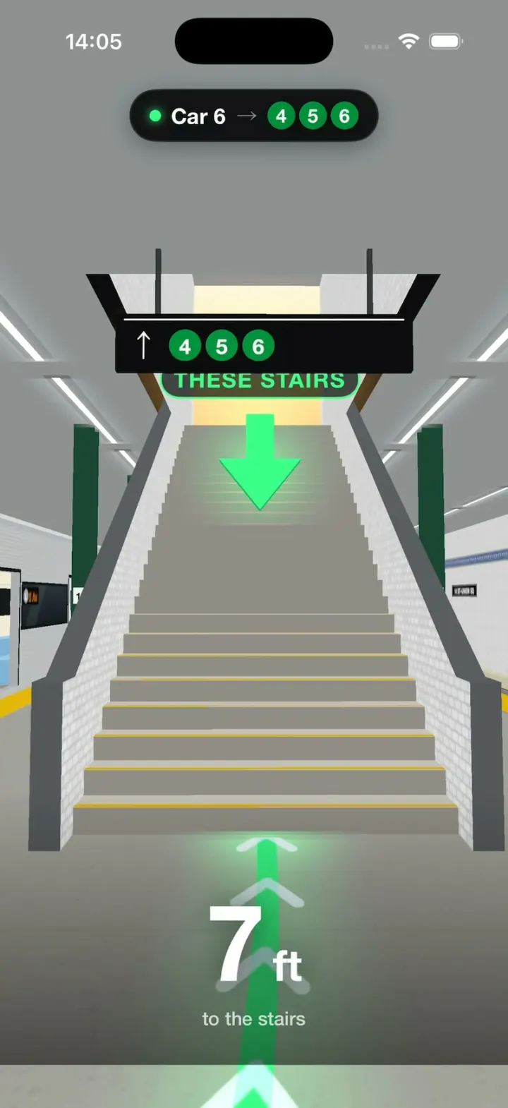
iOS3D NYC subway directions: see which car to board and which stairs to take before you get there.
- View template
Window Seat
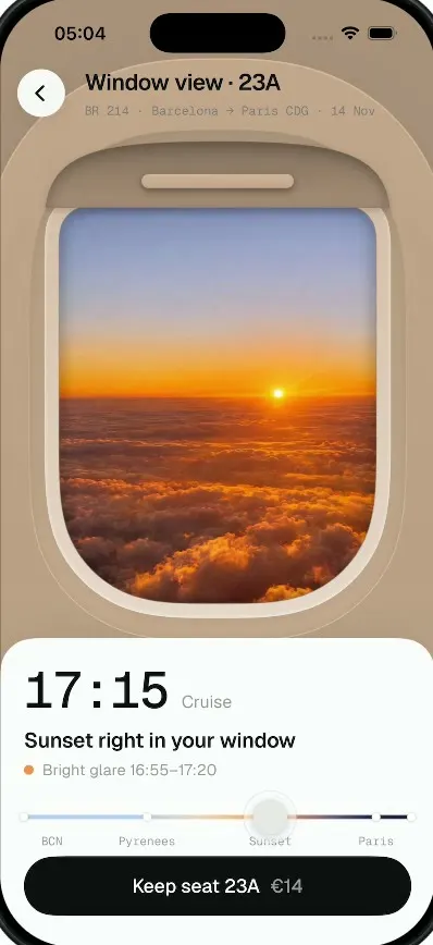
iOSTap a window seat and see your real view out of it, from takeoff to landing, before you pay for it.
- View template
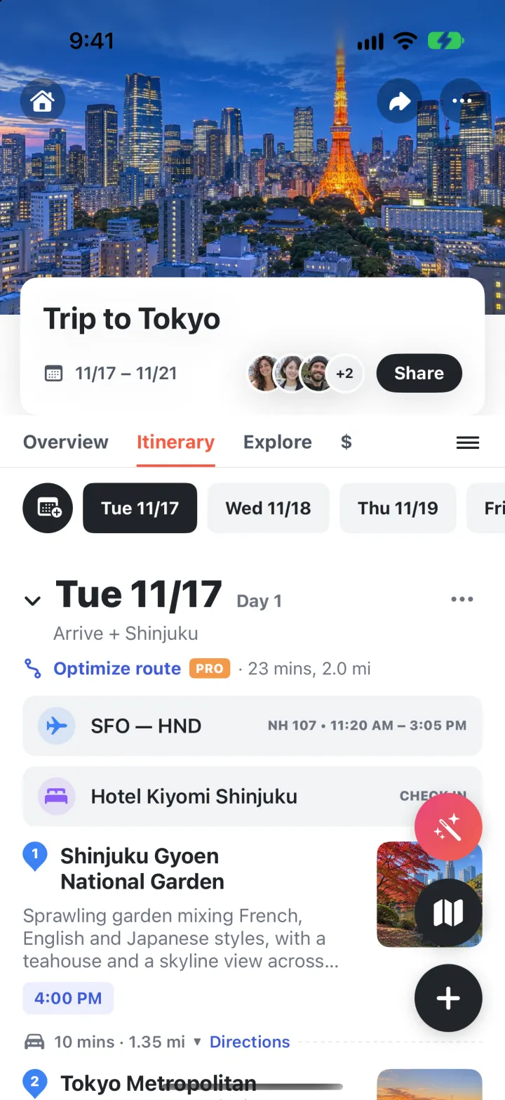
Wanderlog Clone
iOSPlan a whole trip on one screen: day-by-day stops on a map, bookings, split costs and an AI itinerary.
- View template
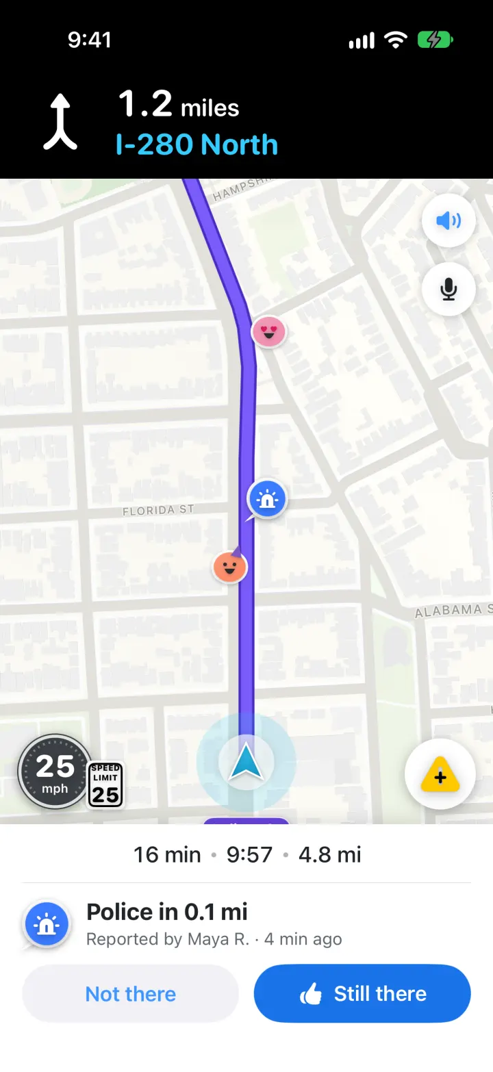
Waze Clone
iOSReal routes, a purple drive line, police alerts you confirm and one-tap hazard reports, all in Waze's look