Shopify Admin
Commerce app · from our videos on X
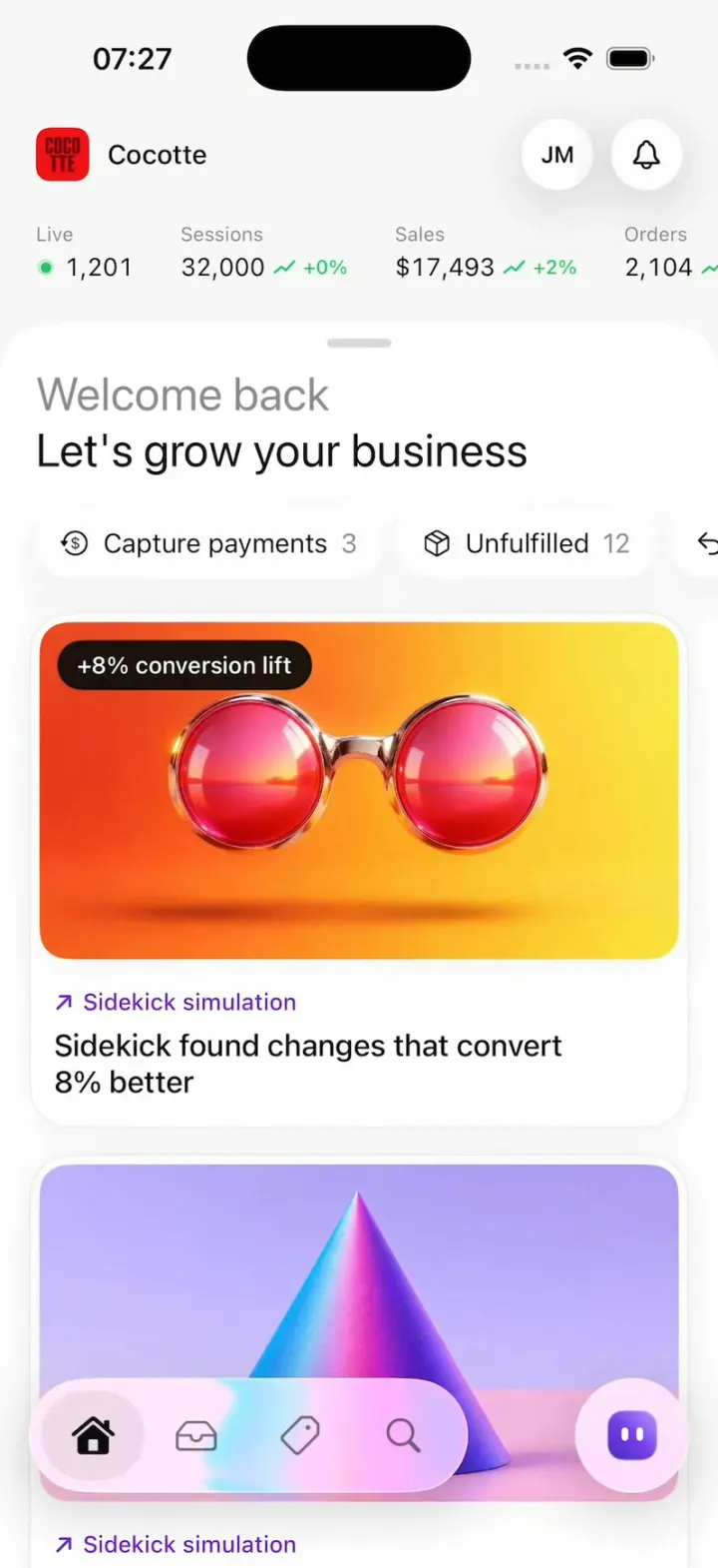
Shopify Admin rebuilds Shopify's redesigned iPhone app for a small kitchenware store called Cocotte. Home is a white sheet over the store's live numbers: drag it down and the sales chart draws in while $17,493 counts up, or tap the Sidekick card for a chat that cascades in AI-drafted product changes to approve. Orders open on #1268 with a glassy risk pill that flips through Low, Medium and High risk and opens into a fraud card, plus the customer, totals and Shop Pay cash. Product pages switch Draft to Active, and one floating button morphs from Edit to Save, Delete and Quick sale. Tap the bell for 'Your first order is in' with tumbling gold coins and a payout checklist.
- iPhone · Swift
- Built in 1 prompt
- Free to remix
Remix copies the working app into your account for free, exactly as we built it. It runs in Vibecode's cloud iOS simulator, in your browser.
Watch the video on X@ios_app_builder · Nov 2, 2026The prompt that builds it
We built Shopify Admin in one prompt. Paste it into a new app to build your own copy, or change it first.
Prompt · 2,764 words
[image attached][image attached][image attached][image attached][image attached][image attached][image attached][image attached][image attached][image attached]
Clone the app shown in this post exactly: Shopify's newly rebuilt iOS mobile admin app, including its visual design, layout, interactions, animations, typography, spacing and all visible states. Make it functional and runnable in the simulator. Reference: https://x.com/MSchwaibold/status/2116172488413425911 (Shopify's design director: "We rebuilt the Shopify mobile app for iOS and Android... smoother gestures, more consistent interactions, fluid animations, and haptics all come together in a beautiful new native design system"). The attached screenshots are frames from the 59-second launch video. Read every one of them before writing code and match them closely.

Build a native SwiftUI iOS app named Shopify using Opus 5.5. It is the Shopify admin for a small store called "Cocotte" (kitchenware), shown on an iPhone. Use the real Shopify name, the Shop Pay purple, the Shopify green, real-looking copy. Do NOT put a fake handset frame inside the app; the simulator provides that. Use realistic deterministic fixture data so every screen is rich without permissions or backend. Do not publish externally.

Observed video sequence (0-59 s):
0-4 s: close-ups of the home sheet header "Welcome back" (grey) / "Mobile got a facelift" (black) and glassy pills "Capture payments 3", "Unfulfilled 12".
4-7.5 s: the home screen: a white bottom sheet over the store header, the Sidekick card with a glossy 3D render and a "+8% conversion lift" badge pops in.
7.5-9.6 s: tapping the Sidekick card opens a Sidekick chat; the "Review changes" card cascades in row by row.
9.7-12.4 s: The Mills product page, Sidekick's suggested copy in purple with a shimmer; at ~12.0 s it is approved and the text turns black.
12.5-16 s: back on Home, the white sheet is dragged DOWN, revealing the analytics chart behind it; the blue line draws in left to right.
16.3-25 s: the order page risk pill: "Low risk" (1 green bar) -> "Medium risk" (2 orange bars) -> "High risk" (3 red bars) -> "Low risk", then the pill morphs open into the "Low fraud risk" card.
25-30.7 s: a product status pill "Draft / 3 channels" (blue dot) flips to "Active / 3 channels" (green dot), then morphs open into the status menu; "Sales channels" expands.
30.7-36.7 s: one floating button morphs through states: "Edit" (glass, pencil) -> "Save" (spinner, then black with a checkmark) -> "Delete" (red, trash) -> "Quick sale" (deep indigo-to-blue gradient with a purple glow).
36.7-41.7 s: product attribute pills assemble; the order summary card builds line by line.
42.3-48.3 s: order #1268 detail on the phone, tap the customer card -> the customer sheet slides up over a map, "Orders history 8" rows slide in.
52.7-57.7 s: "It's all happening!" / "Your first order is in" with 3D gold coins tumbling down, then the black payout card; "Activate payouts" gets a green check while "Process payouts" spins.

GLOBAL STYLE
- Background #F7F7F7 behind white (#FFFFFF) cards; text #0A0A0A; secondary text #8A8A8A; Shopify green #22C55E-ish for positive deltas (+2%) and success; Shop purple #5A31F4 for "shop cash" and Sidekick accents; Sidekick suggestion purple #6D28D9 to #7C3AED.
- Typography: SF Pro (system). Large headings 26-28 pt regular (not bold), body 15-17 pt, small labels 12-13 pt.
- Pills and floating buttons are glassy capsules: use iOS 26 Liquid Glass (.glassEffect(.regular.interactive(), in: .capsule)) when available, else .ultraThinMaterial + a 1 pt white top highlight stroke + a soft 10 pt shadow. Cards: white, 24 pt corner radius, hairline #ECECEC border, soft shadow.
- Every state change uses springs (response ~0.45, damping ~0.8), matchedGeometryEffect for morphs, and light haptics (UIImpactFeedbackGenerator) on taps.
- Status bar shows normally. Floating bottom tab bar (glass capsule, ~64 pt high, inset 16 pt from the sides and bottom) with 4 icons on the left: Home (house.fill when selected, black), Orders (tray), Products (tag), Search (magnifyingglass); and on the right a separate round glass button with the Sidekick glyph (a small purple/indigo gradient "face" glyph). Tapping a tab always resets that tab to its root screen.

IMAGES: generate them with gpt-image-2.5-flare. Run env, use the project's proxied OPENAI_API_KEY with https://api.openai.com/v1/images/generations (size 1024x1024, transparent background for the coin), save into the workspace as asset-catalog images. Needed: (1) "The Mills": two glossy two-tone pepper/salt mills (pink body + dark plum dome cap) on a red/orange studio set, hard shadows; plus two variants: blue mills on red, purple mills on orange; (2) "Fonte Toaster": a green retro toaster on red; (3) "Studio Mug (set of 4)": blue ceramic mugs, hand holding one; (4) "The Maison Espresso": red espresso machine on blue; (5) Sidekick card hero: glossy pink-red round sunglasses / binocular-like 3D render on an orange-to-yellow gradient with soft grain, wide crop; (6) second card hero: iridescent blue-to-magenta cone on a pink floor, grainy 3D render; (7) a gold coin, 3D, slight bevel, embossed Shopify shopping-bag "S" logo, transparent background; (8) store logo "Cocotte": red rounded square with dark maroon stacked letters; (9) a light minimal city map (cream blocks, pale blue canals, white streets) for the customer card and customer sheet.

SCREEN 1 - HOME (tab 1)
- Top header (on #F7F7F7, behind the sheet): store logo 30 pt rounded square + "Cocotte" 15 pt; at the right a round glass "JM" avatar button and a round glass bell button.
- Metrics row under it (horizontal, small): "Live" over "● 1,201" (green dot); "Sessions" over "32,000 ↗ +0%"; "Sales" over "$17,493 ↗ +2%"; "Orders" over "2,104 ↗ +4%". Labels 11 pt grey, values 14 pt, deltas 11 pt green with a tiny sparkline tick.
- Analytics view behind the sheet (visible when the sheet is pulled down): a segmented row "Sessions ⌃⌄" (selected, glass capsule) "Sales" "Orders" "Conversion" (grey); big "$17,493" 30 pt with green "↗ +2%"; a smooth blue (#3B6FF5) line chart with a soft blue glow under it and a dashed light-blue comparison line, x labels "May 31" (left) and "June 30" (right); below it the text: "Sessions reached 31,457, up 5% vs. the previous period. Check your traffic sources to see where shoppers are finding your store." where "reached" has a light purple highlight and "31,457, up 5%" is purple.
- The white bottom SHEET (rounded top 28 pt, grabber 36x5 grey) covers the screen from just below the metrics row. It has two detents: EXPANDED (top just below the metrics row, default) and COLLAPSED (top at ~72% of the screen height). Dragging the sheet (or its grabber) DOWN past 60 pt snaps it to COLLAPSED and the analytics chart line draws in left-to-right (trim 0->1 over 1.1 s, easeInOut) and the big number counts up; dragging it UP snaps it back. The sheet follows the finger 1:1 while dragging. When collapsed, the metrics row cross-fades into the analytics segmented row.
- Sheet content: "Welcome back" (26 pt, grey #8A8A8A) and "Let's grow your business" (26 pt, black) - top-left, 20 pt padding. Then a horizontal scrolling row of glass pills: [dollar-circle-arrow icon] "Capture payments 3", [shipping box icon] "Unfulfilled 12", [return arrow icon] "Returns 2" (the count is grey).
- Then the Sidekick card (white card): hero image (sunglasses render) 16:9 with 16 pt radius and a black capsule badge "+8% conversion lift" at its top-left; below: purple "↗ Sidekick simulation" (13 pt) and "Sidekick found changes that convert 8% better" (17 pt black, 2 lines). When Home appears, the card pops in (scale 0.94 -> 1 + fade, spring) and the badge pops 0.3 s later.
- Below: a second card with the cone render and "↗ Sidekick simulation" / "Your bestsellers are trending on Shop. Feature them on your home page." Then a little more content so the sheet scrolls.
- Tapping the Sidekick card opens SCREEN 2. Tapping the bell opens SCREEN 8 (first order celebration). Tapping the "Unfulfilled 12" pill opens order #1268 (SCREEN 4).

SCREEN 2 - SIDEKICK CHAT (full-screen sheet sliding up from the card, matched-geometry feel)
- Top bar: round glass X (left), title "Audit your kitchenware... ⌄" (15 pt, centered), compose icon (right).
- Assistant message (no bubble, 15 pt): "I've drafted changes to 11 of your products that should help them sell better. Review them and approve the ones you want to publish." It fades in; under it small copy / thumbs-up / thumbs-down icons.
- Then the "Review changes" card (white, subtle purple-to-white gradient at its bottom edge): "Review changes" (17 pt semibold), then "[tag icon] Products 11". Rows (each with the product thumbnail 44 pt rounded 10, name 15 pt, purple "N changes >" 14 pt, and at the right a black "✕" and a green "✓"): "The Mills" / "3 changes", "Fonte Toaster" / "2 changes", "Studio Mug (set of 4)" / "3 changes", "The Maison Espresso ..." / "3 changes". Rows cascade in one by one (0.12 s stagger, slide up 12 pt + fade). Bottom of the card: "Deny all" (light glass capsule) and "Approve all" (black capsule, white text).
- Bottom composer: glass capsule with the Sidekick glyph, placeholder "Ask a follow-up...", a "+" and a black round voice button.
- Tapping "The Mills" row opens SCREEN 3. Tapping ✓ on a row turns it into a green "Approved" state. X closes back to Home.

SCREEN 3 - PRODUCT "The Mills"
- Top: horizontal carousel of 3 square photos (the 3 mills images, 22 pt radius, peeking), a round white "+" button floating on the third.
- Title "The Mills" (28 pt) and description "Spice cabinets are for the timid. These mills were made to stay out and sit centre table. A dome for salt, a column for pepper, lacquered in two-tone..." (19 pt) and price "$59.00": when the page opens these are Sidekick's suggestion: purple (#6D28D9) with a soft white shimmer sweeping across the text in a loop. Tapping the title/description/price (or a floating "Approve" glass pill under them) approves it: the purple animates to black over 0.5 s and the shimmer stops.
- Pills row: [channels icon] "5 channels", [tag icon] "Mills in Kitchenware" (with "in Kitchenware" grey), round "⋯" button.
- STATUS PILL (small glass capsule): blue dot + "Draft" / "3 channels" (grey 2nd line). The blue dot has a soft blue glow pulse. Tap 1: it flips to green dot + "Active" / "3 channels" (green glow). Tap 2: the pill morphs open (matched geometry) into a menu card: "✓ Active", "Draft", "Unlisted", divider, "[channels icon] Sales channels >". Tapping "Sales channels" expands it in place (chevron rotates down) showing "✓ [storefront icon] Online Store", "✓ [POS icon] Point of Sale", "✓ [bag icon] Shop". Tap outside closes it back to the pill.
- ATTRIBUTE PILLS (glass capsules, wrapped): "Color" with three swatches (light pink #E8A0A0, rose #C0566E, black), "Size S, M, L" ("S, M, L" grey), "[channels icon] 5 channels", "[stack icon] T-shirts in Clothing" ("in Clothing" grey), "[tag icon] All, Bestsellers", "[layout icon] Default product". They assemble in with a stagger when they scroll into view.
- MORPHING ACTION BUTTON floating at the bottom center (above the tab bar): one capsule that changes on each tap with a spring width/color morph: (a) glass "✎ Edit" -> tap -> (b) grey "Save" with a small spinner for 0.45 s, then black "✓ Save" -> tap -> (c) red #D7001B "🗑 Delete" (trash outline icon) -> tap -> (d) "Quick sale": a wider capsule with a deep indigo #1A1F6B to bright blue #2F4BEA horizontal gradient, a white circular "S"-coin icon on the left, white text, and a purple glow underneath; the gradient slowly sweeps -> tap -> back to (a).

SCREEN 4 - ORDER #1268 (Orders tab root is a list: "#1268 Danielle Hudson $339.99 Unfulfilled", "#1267 Maya Chen $112.00 Fulfilled", "#1039 Danielle Hudson $345.00 Unfulfilled", a few more; tapping a row opens the order)
- Header: back button, big "#1268" (32 pt), a small "Paid" and "Unfulfilled" (yellow #FFE45C) badge.
- RISK ROW: a glass capsule pill "Low risk" + a 3-bar meter (1 bright green bar with a green glow, 2 grey bars), and next to it a wider glass capsule containing a printer icon and "⋯". The risk pill is tappable: tap 1 -> "Medium risk" (2 orange #F59E0B bars, the pill widens), tap 2 -> "High risk" (3 red #E11D2E bars), tap 3 -> back to "Low risk", tap 4 -> the pill morphs open (matched geometry, spring) into a card: "Low fraud risk" (17 pt) with the meter at the top-right, "No strong indicators match known fraud patterns. This order looks safe." (15 pt grey), and a full-width white capsule button "About this order"; the printer/⋯ capsule slides to the right of the card's top. Tap outside -> collapses back to the "Low risk" pill. Text changes cross-fade with a slight blur.
- Line items: thumbnail + "The Mills" with small pills "Color Pink" "Set 2 mills" and "× 1" at the right; "Fonte Toaster" with "Color Green" "Type Toaster" and "× 1".
- Customer card: the map image as the card background (fading to white on the left), "Danielle Hudson" (15 pt semibold), "Prinsengracht 840-2, 1017" / "JM Amsterdam" (grey), round glass phone and mail buttons on the right. Tapping it opens SCREEN 5.
- Summary card: "Subtotal · 2 items" $241.50; "Discount · 10OFF" -$30.00; "Shipping · Express shipping" $5,89; "Total" $339.99 (semibold). Below it, in a grey inset section of the same card: the purple "shop" badge + "cash" (Shop Pay purple) $50; a Mastercard logo chip + "0029" (monospaced) $289.99 (grey). When the order opens the summary lines build in one by one (stagger 0.1 s).
- "Timeline" heading, then a "+" round button and a "Leave a comment" capsule field.

SCREEN 5 - CUSTOMER SHEET (slides up over the order, near full height)
- The map image fills the top ~35% and fades to white; a blue location dot with a white ring and a pale blue halo pulses on it; top bar: round glass X (left) and a glass capsule with phone, mail and "⋯" icons (right).
- "Danielle Hudson" (28 pt), "915 King St W, Toronto, ON", "maya.chen@gmail.com", "+1 555-555-5555" (grey 16 pt).
- "Orders history 8" ("8" grey), then rows that slide in from below one by one: stacked product thumbnails (2 overlapping, rotated slightly) + "#1039" (20 pt) + a glass pill "● Paid $345" + a yellow "Unfulfilled" badge at the right; the Mills thumbnail + "#1268" + "● Paid $566" + a grey "Fulfilled" badge.
- Bottom glass panel: pills "● Email subscribed" (green dot; "subscribed" grey), "○ SMS not subscribed", a round "⋯"; second line "# Tags", "Tax exemptions", "✎ Notes".

SCREEN 6 - PRODUCTS tab: list of the 4 products with thumbnails, prices, and status pills; tapping one opens SCREEN 3 (all show The Mills layout with their own name/image).

SCREEN 7 - SEARCH tab: a glass search field and recent searches; simple.

SCREEN 8 - FIRST ORDER CELEBRATION (tap the bell on Home)
- Full-screen white overlay. "It's all happening!" (30 pt grey) and "Your first order is in" (30 pt black, medium) fade/slide in at the center. 14 gold coins (the coin image) tumble down from above the screen with random sizes (40-140 pt), 3D rotation (rotation3DEffect around x and y, spinning), slight blur on the biggest/nearest ones, gravity-like easing, passing behind and in front of the text, for about 2.5 s.
- Then the text fades and a black card (28 pt radius) springs up into the center: "Collect $24.99 for your first order. It's go time!" (white 20 pt, 2 lines), a yellow #FFE45C capsule "Due Sept 30" at the top-right, a checklist: dashed circle + "Activate payouts", dashed circle + "Process payouts" (grey), and a white capsule button "Activate payouts".
- Tapping "Activate payouts" (the button or the row): the first dashed circle spins and fills into a green #34C759 circle with a white checkmark (spring), "Activate payouts" turns white, and the "Process payouts" dashed circle starts rotating like a spinner. Tap outside the card or swipe down closes it back to Home.

Keep every file you create inside /home/user/workspace (fonts, generated images, scripts): tool access to /tmp and other paths outside the workspace is denied in this sandbox.

Build fully, run compile/build validation, resolve all errors, and launch in the web simulator on an iPhone. Prioritize fidelity to the attached screenshots and the interactions above (the sheet drag that reveals the chart, the Sidekick review cascade, the risk pill states and card, the status pill + menu, the morphing action button, the customer sheet, and the coin celebration). Deliver the complete implementation rather than a plan.
More templates
All templates- View template
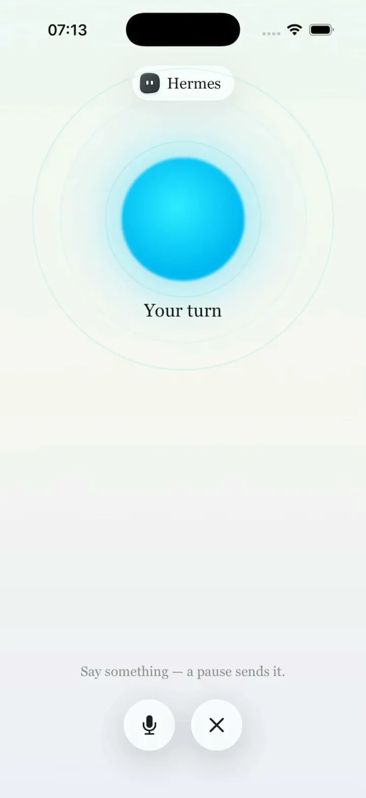
Hermes Agent
iOSHermes Agent's iPhone app: a breathing Live Mode orb, routines to Discord, one-tap skills, a Midnight theme.
- View template
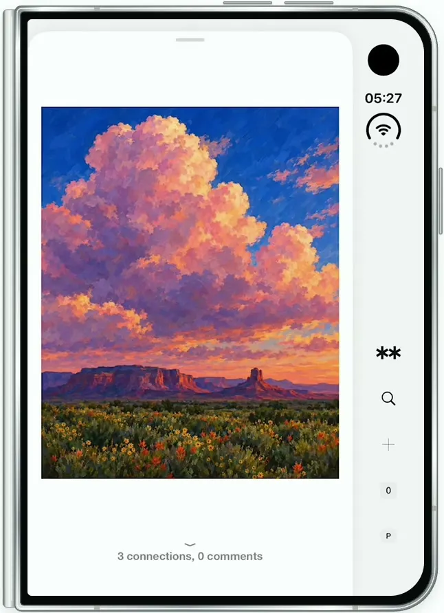
Are.na
iOSAre.na on the folded iPhone Duo: channels of art, a swipeable block viewer, full-screen images and details.
- View template
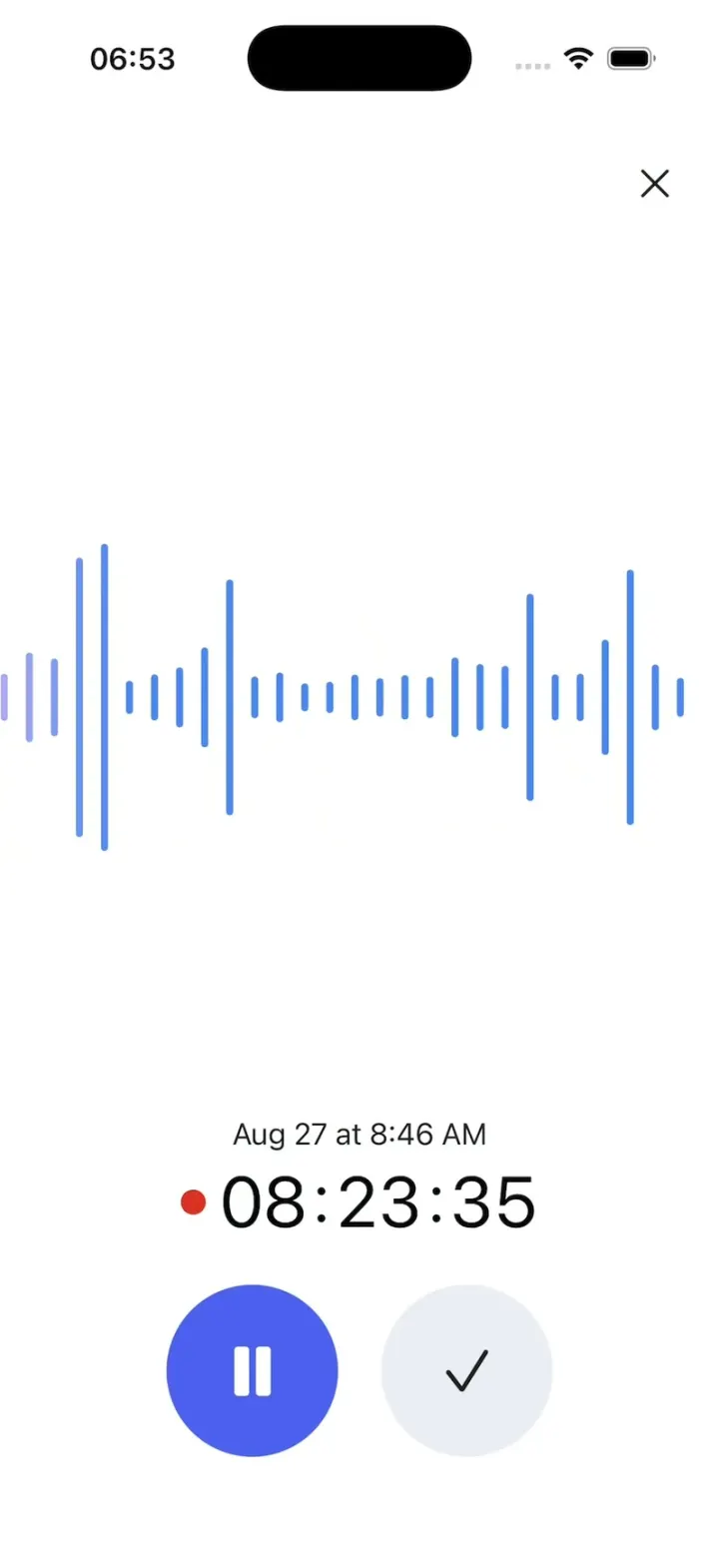
Gemini Notebook
iOSRecord a lecture with a live waveform, then ask it anything and get answers cited back to the transcript.
- View template
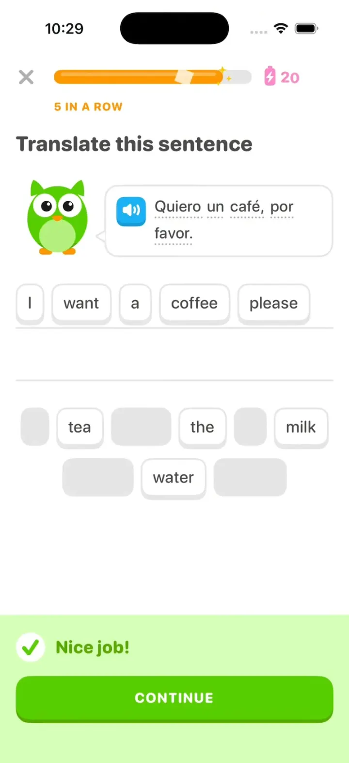
Duolingo Clone
iOSDuolingo with its real look: word chips fly to the line, "Nice job!" slides up and your streak rolls to 28.