Qredible
SaaS website · from our videos on X
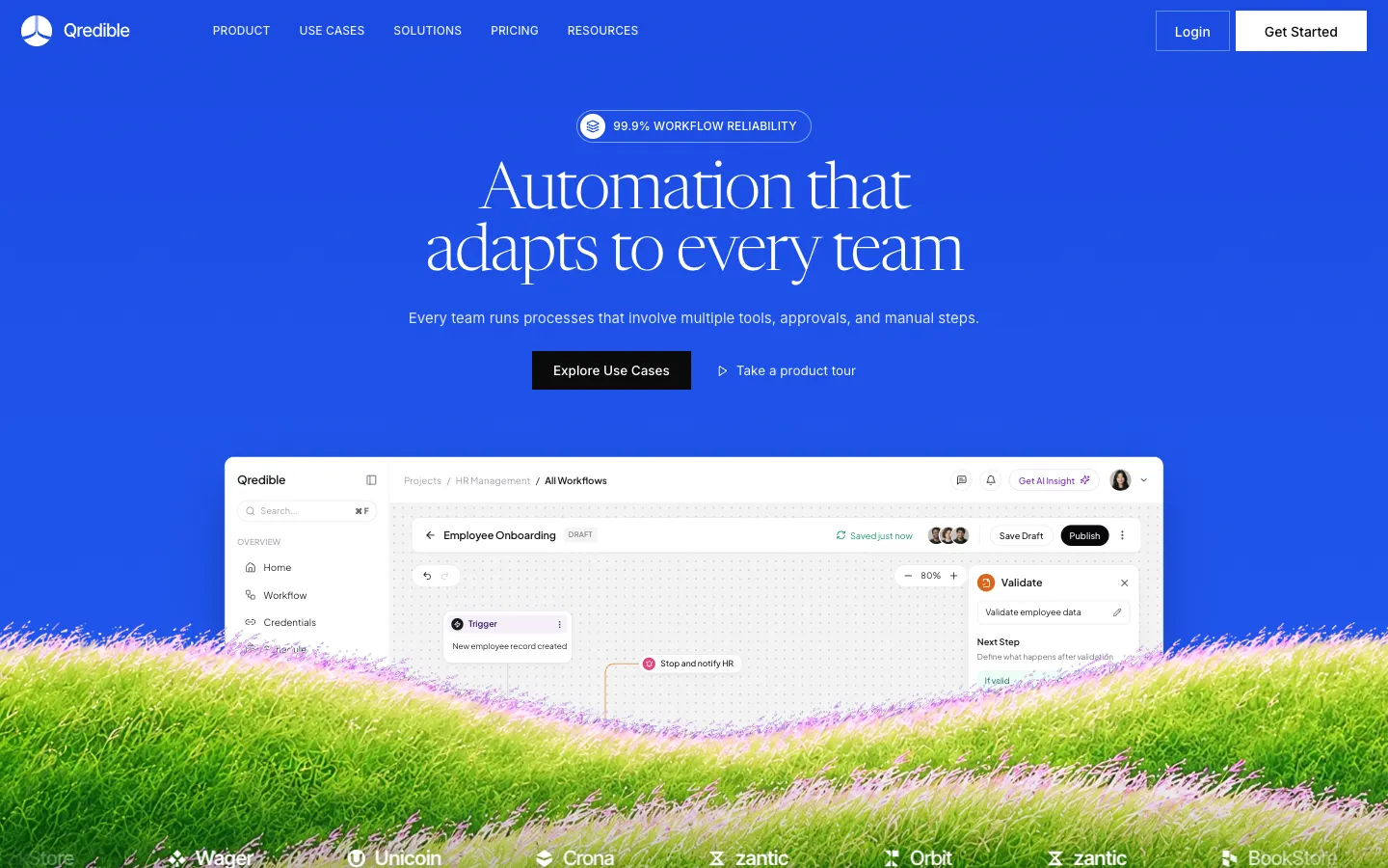
A full marketing website for Qredible, a fictional workflow automation platform. Vivid cobalt skies, elegant Newsreader serif headlines and generated grass hills with pink flower tips frame a real HTML product window and a navy use-case bento. It has ten pages: home, an interactive workflow builder on the Product page, Pricing with a monthly/annual toggle and comparison table, Customers, Blog with filters and articles, Book a demo, Log in, Sign up and a 404. Demo requests, newsletter signups and accounts save to the backend, and tabs, carousels, accordions and the mobile menu all work.
- Web app
- Hand-built
- Free to remix
Remix copies the working app into your account for free, exactly as we built it. It runs in your browser.
Watch the video on X@vibecodeapp · Nov 20, 2026The prompt that builds it
We wrote Qredible by hand. This prompt describes the finished app: paste it into a new app to build your own version, or change it first.
Prompt · 596 words
Build a full marketing website for Qredible, a workflow automation platform for every department (HR, finance, sales, operations, IT). Tagline: "Automation that adapts to every team".

LOOK: Vivid cobalt-blue sky (#1B50EA, gradient #1646E1 to #1C52EC with faint grain) for the hero, page headers and final CTA; deep navy (#0D2F89) for use-case cards, the how-it-works band and the footer; white and light grey (#EDEDEE) sections; near-black (#0A0A0A) buttons. Display headlines in Newsreader weight 300 with tight tracking (hero ~67px, sections ~57px), body and uppercase nav in Inter, card titles in Inter Tight, product UI in Plus Jakarta Sans. Square-cornered buttons (white "Get Started", outlined "Login", black "Explore Use Cases"), pill eyebrows with a black disc and layers icon. Imagery: generated dreamy 3D-render rolling hills of hyper-detailed green grass with fuzzy pink-lilac flower tips under a flat cobalt or navy sky, no text; the hero and CTA hills are transparent cut-outs so the product window sinks into the grass. Thin white arcs, faint discs and a dot grid decorate the navy cards. Motion: scroll-reveal fades, hero entrance, slow grass drift and parallax, infinite logo marquees, animated line chart and counters, auto-advancing tabs; all off under prefers-reduced-motion.

PAGES:
1. Home: nav (PRODUCT, USE CASES, SOLUTIONS, PRICING, RESOURCES); hero with "99.9% WORKFLOW RELIABILITY" pill, serif headline, subtitle, Explore Use Cases + "Take a product tour"; a real HTML product window (sidebar Home/Workflow/Credentials, breadcrumb Projects / HR Management / All Workflows, Get AI Insight, "Employee Onboarding DRAFT" toolbar with Saved just now, avatars, Save Draft, Publish, Trigger node, "Stop and notify HR" chip, Validate side panel) half-sunk into grass with a marquee of fictional SVG wordmarks (zantic, BookStore, Wager, Unicoin, Crona, Orbit) on the front hill; "Automation for every department" bento of navy cards with grass: Business Operations (briefcase and coins nodes), Finance & Accounting (Trigger, Extract Data, Validate chain with a "good flow" cursor), Sales & CRM (Lead Qualification Trend line chart, 124 leads tooltip, +18%), IT & Support (ticket routing), HR & People (onboarding checklist); platform tabs Build/Validate/Collaborate/Monitor with live UI mocks; how it works (4 steps on navy over grass); stats with counters; integrations marquee; testimonial carousel; pricing teaser with monthly/annual toggle; FAQ accordion; final CTA over grass; big navy footer with newsletter and a giant serif wordmark.
2. Product: an interactive mini workflow builder (add steps from a palette, drag to reorder, edit a step in the inspector, undo/redo/reset, Run test lights each step in turn, Publish flips DRAFT to LIVE), feature rows (Validation, Collaboration, AI Insight), capability grid.
3. Pricing: Starter/Team/Business/Enterprise cards with a monthly/annual toggle that changes prices, a full comparison table, pricing FAQ.
4. Customers: logo wall, three case studies with metrics, testimonials, company story, values, team of six.
5. Blog index with working category filter and a featured post; article pages with related posts.
6. Contact / Book a demo with a validated form (name, work email, company, team size, department, message).
7. Log in and Sign up (split screen with grass art), and a 404 with a lone grass flower.

WHAT WORKS: demo requests, newsletter signups and accounts (hashed passwords, real login check) POST to a Hono backend and are stored in SQLite with success and error states; mobile hamburger opens a full-screen menu; tabs, toggles, accordion, carousel and marquees all move.

RULES: designed for 1440, 1024, 768 and 390 px with no horizontal scroll; respect reduced motion; fictional people and logos only.

REMIX-READY: brand.ts holds name, colours, fonts, nav, hero copy and plans; longer copy in content/*.ts; each section is its own small component; README explains renaming, recolouring and swapping images.
More templates
All templates- View template
Porchlight CRM
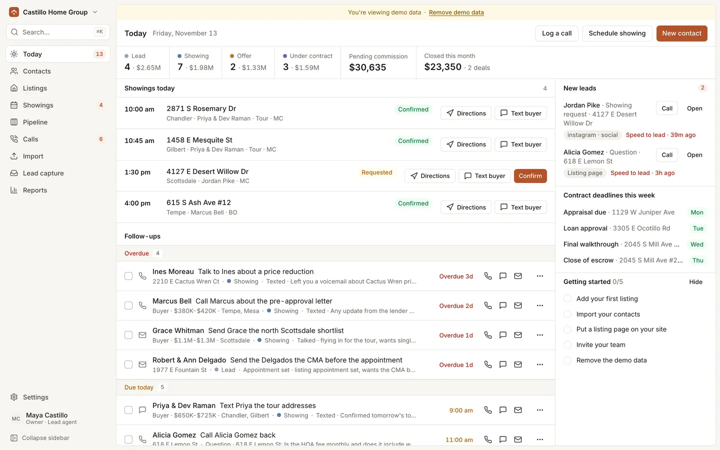
WebA real estate agent CRM: today's showings first, listing pages that book tours, and commission on every deal.
- View template
Blue Bottle Coffee Clone
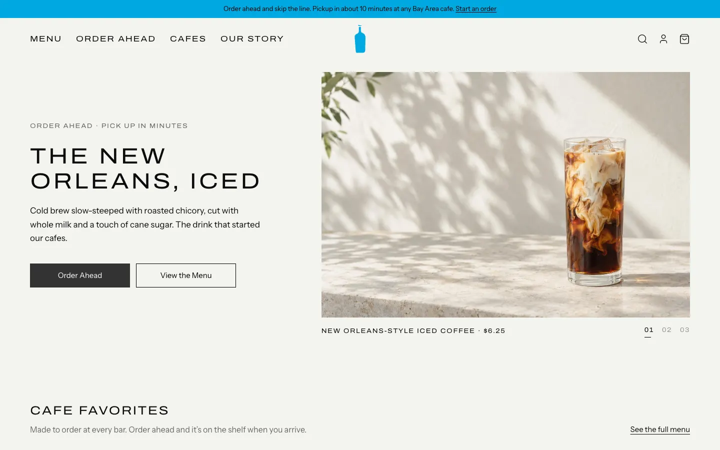
WebBlue Bottle's cafe site rebuilt: priced menu, cafe map with live hours, order-ahead pickup, barista board.
- View template
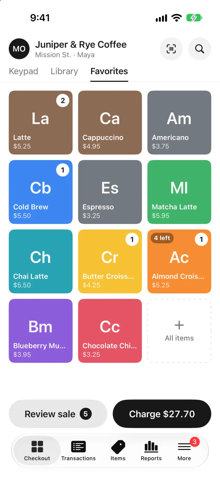
Square Point of Sale Clone
iOSSquare POS for a café: tap tiles, charge with Tap to Pay or cash, and watch stock and profit update live.
- View template
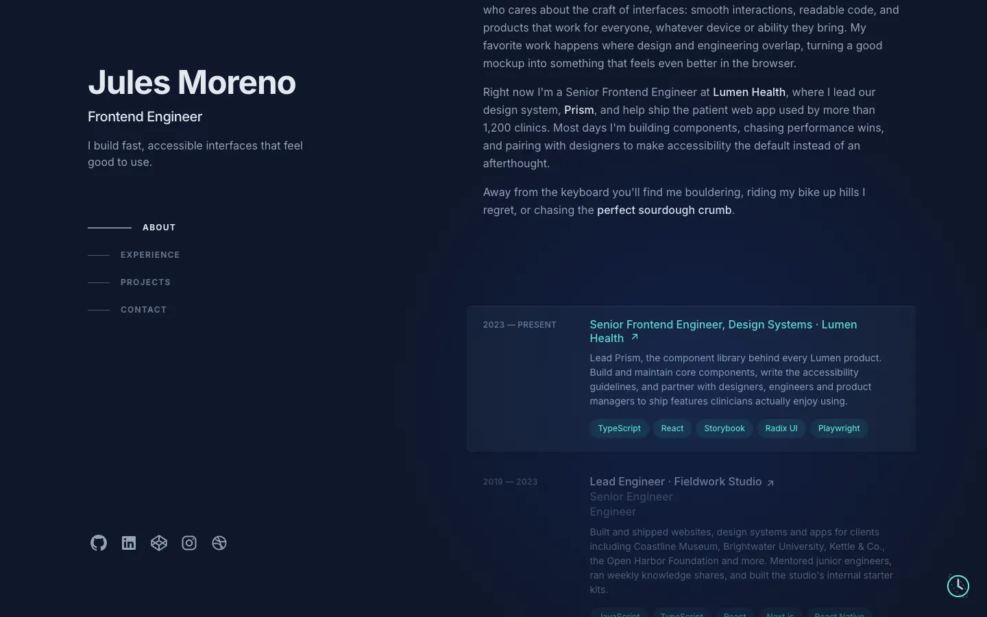
Brittany Chiang Portfolio Clone
WebThe famous slate-and-teal developer portfolio, with case studies, a résumé, a contact inbox and an editor.