Notion Clone
Docs app · built by the Vibecode team
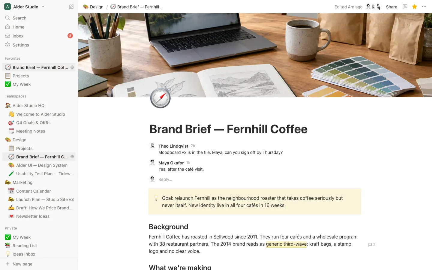
Notion Clone opens on Alder Studio, a fictional design studio's workspace: teamspaces and private pages in the sidebar, 25 pages and three databases (Projects, Content Calendar and Reading List). Pages have covers, emoji icons and a real block editor: type / for headings, to-dos, toggles, callouts, highlighted code, tables and sub-pages, use markdown shortcuts, drag blocks by their handle, and select text to format it or leave an inline comment. Databases switch between Table, Board, Calendar and Gallery views with filters, sorts and drag and drop, and any row opens as a page in a side peek. ⌘K search, templates, Trash, Inbox, version history with restore, dark mode and a public read-only Publish to web page all work against a real database. Log in with the demo account shown on the login screen.
- Web app
- Built in 5 prompts
- Free to remix
Remix copies the working app into your account for free, exactly as we built it. It runs in your browser.
The prompt that builds it
We built Notion Clone in 5 prompts. Here they are folded into one, so a single paste into a new app builds the finished version.
Prompt · 11,062 words
Build "Notion Clone" using Opus 5.5: a full web clone of Notion in its current (2026) design, with the real name, colours, layout and words, running a fictional design studio's workspace called "Alder Studio". It must look and feel like the real Notion web app: the sidebar, the page with cover, icon and title, a block editor that really works, databases with Table, Board, Calendar and Gallery views, comments, search, templates, share and publish to web, and page history. Every person, company, photo and piece of content is fictional.
Design references (the original screenshots are not included; build from these descriptions):
- Reference: the app shell: sidebar, top bar (breadcrumb, "Edited 1m ago", Share, comments, star, ⋯), a page with cover image, emoji icon overlapping the cover, big title, a page comment, body text, the empty-line placeholder.
- Reference (Slash menu): the "/" menu: "Basic blocks" list with icons and markdown hints on the right (#, ##, ###, -), "Close menu esc" footer, "/Type to search" ghost text.
- Reference: the ⋮⋮ block menu ("Search actions…", Turn into, Color, Copy link to block, Duplicate ⌘D, Move to, Delete, Comment, "Last edited by …") with the "Turn into" submenu, and the selected block tinted blue.
- Reference: the current inline formatting toolbar (compact two-row card: Turn into, A colour, B, I, U / link, strikethrough, code, more / "Comment").
- Reference: an inline comment: yellow highlighted text and the thread card in the right margin (avatar, name, "17h", text, reply, resolve ✓ and ⋯ on hover).
- Reference: Share popover on the "Publish" tab after publishing, and the blue "This page is live on …" banner across the page top.
- Reference: the Version history modal: read-only page preview on the left, list of versions on the right ("Today · 4:27 PM" / author), blue "Restore".
- Reference: a database Table view: view tabs ("All items" active pill, "Calendar view", "By status"…), filter/sort/search icons, header icons per property type, Status pills with dots, coloured multi-select tags, person with avatar, full dates, checkboxes, URL.
- Reference (Database board): the Board view grouped by status: tinted columns, status pill + cards with title, person, tags, date.
- Reference (Database calendar): the Calendar view: "November 2026", "‹ Today ›", Sun–Sat, weekend cells tinted, today's date in a red circle.
- Reference (Database gallery): the Gallery view (Reading List): page with a cover photo, view tabs with icons, cards with a book cover, title, author, status pill and rating.
- Reference: the search modal: input, "Search results (1)" with "Best matches ˅", result row with breadcrumb + "Edited Oct 24, 2022", preview pane on the right, footer "⌘↵ Open in new tab".
- Reference: the icon picker (Emoji / Icons / Upload tabs, Remove, Filter… input, shuffle, skin tone, "People" grid, category bar at the bottom) and the "Get started with" chips at the bottom of a new page.
- Reference: the add-property menu: "Type property name…" input and "Select type" in two columns.
- Reference: the Share tab: "Email or group, separated by commas" + blue Invite, people with "Full access ˅", "General access", "Copy link".
- Reference: the page ⋯ menu: "Search actions…", Ag Default / Serif / Mono, Copy link, Duplicate, Move to, Move to Trash, Small text and Full width toggles, Lock page, Export, Version history.
Copy the layout, spacing, type and colours from these screenshots exactly. Do not copy the people, emails or text in them; use the Alder Studio fixtures below. Leave out every AI feature (Notion AI, Agents, "Ask AI", "New chat", AI skills, "Generate", meeting notes recording): this clone has no AI.
Build it fully, run it, and fix every error. Deliver the complete app, not a plan.
## Stack and approach
Use the platform's standard setup: the React web app, the Hono backend with Prisma for the database, and Better Auth (email + password). Everything (workspaces, members, teamspaces, pages and their blocks, databases, properties, views, rows, comments, versions, favourites, inbox, trash, sharing, published pages, uploads) lives in the database and is seeded with the demo data below on first start, so the app is full the moment you log in. Every edit saves to the backend (debounced 600 ms for typing, immediate for everything else) before any toast says it saved. The backend seeds the demo workspace on startup whenever the database has no workspace, so a fresh copy works even without the database file. Before validating env, if BETTER_AUTH_SECRET is missing or blank, the backend generates 32 random bytes (base64, node:crypto), writes them into backend/.env (replacing the empty line or appending one), sets process.env and logs "Generated a new BETTER_AUTH_SECRET"; a set secret is never changed. This way a remixed copy, whose .env values are cleared, still boots.
Block editor: use BlockNote (@blocknote/core, @blocknote/react, @blocknote/mantine, and @blocknote/code-block for syntax highlighting; never the @blocknote/xl-* packages). It gives real Notion block mechanics: caret handling, Enter/Backspace, nesting with Tab/Shift-Tab, undo/redo, paste, drag handles, multi-block drag, tables, images. Read the installed version's types in node_modules before using an API. Replace every piece of BlockNote's default UI (slash menu, formatting toolbar, side menu, drag-handle menu, link toolbar, table handles where needed) with your own components styled exactly like Notion, and override BlockNote's CSS so nothing looks like stock BlockNote or Mantine. Add custom blocks: Callout, Divider (if not built in), Page (sub-page), Link to page. Store each page's blocks as BlockNote JSON in the page row, plus a plain-text copy for search.
Other libraries: React Router, TanStack Query (optimistic updates), Zustand for UI state, @dnd-kit for sidebar, board and calendar drag and drop, lucide-react for UI icons (thin 1.5 stroke, 16-20 px, colour #91918E), emoji data from @emoji-mart/data (render your own picker), date-fns. No shadcn default look anywhere.
## Design tokens (light theme, measured from the refs)
- Font: `ui-sans-serif, -apple-system, BlinkMacSystemFont, "Segoe UI Variable Display", "Segoe UI", Helvetica, "Apple Color Emoji", Arial, sans-serif, "Segoe UI Emoji", "Segoe UI Symbol"`. Serif page style: `Lyon-Text, Georgia, ui-serif, serif`. Mono page style and code: `"SFMono-Regular", Menlo, Consolas, "PT Mono", "Liberation Mono", Courier, monospace`.
- Text primary #2C2C2B, secondary #7D7A75, tertiary/placeholder #A19E99, icons #91918E. Page background #FFFFFF. Sidebar #F8F8F7 with a 1 px #EDEDEB right border. Hover fill rgba(44,44,43,0.05) (≈#F1F0EF on white); selected sidebar row #EEEDEC; menu hover row #F0EFED. Dividers and table lines #EDEDEB (header bottom line #E9E9E7).
- Accent blue #2383E2 (hover #0077D4): primary buttons ("Invite", "New", "Publish", "View site", "Restore", "Use this template", "Continue"), checkboxes when checked, focus rings, links in menus. It is the only accent colour.
- Block selection tint #E2EDFB (rgba(35,131,226,0.14)). Text selection rgba(35,131,226,0.28). Live-page banner bg #E7F3FC with blue text #1F6FBF. Inline comment highlight bg #FDF3C7 with a 2 px bottom border #EBC44F. Today circle #E56458 with white text.
- Select / multi-select / status colours (bg / text), exactly: Default #F0EFED / #2C2C2B; Gray #E6E5E3 / #494846; Brown #EBDFD7 / #584437; Orange #F3DDCB / #6A4222; Yellow #F2E3B7 / #655121; Green #D7E6DD / #2A533C; Blue #CBE3F7 / #264A72; Purple #E6DCF0 / #553A73; Pink #F1DBE7 / #6B2F51; Red #F8DAD6 / #74302A. Select pills: 20 px tall, radius 4 px, 12-14 px text, padding 0 6 px. Status pills: radius 10 px (fully round) with a 8 px dot in the text colour before the label. Board column backgrounds are the same hue very light (gray #F9F8F7, blue #F3F9FD, green #F6F9F7, orange #FBF6F2, yellow #FBF8EE, purple #F8F5FB, pink #FBF5F8, red #FCF5F4, brown #F9F6F3), and the column header pill is a shade darker (gray #E0DEDC, blue #C2DEF5, green #D0E1D6).
- Text colours (inline and block "Color"): gray #787774, brown #9F6B53, orange #D9730D, yellow #CB912F, green #448361, blue #337EA9, purple #9065B0, pink #C14C8A, red #D44C47. Background colours: gray #F1F1EF, brown #F4EEEE, orange #FBECDD, yellow #FBF3DB, green #EDF3EC, blue #E7F3F8, purple #F6F3F9, pink #FAF1F5, red #FDEBEC.
- Code: block bg #F7F6F3, radius 4 px, padding 32 px 16 px 32 px 24 px, 85% font size, line-height 1.5. Highlighting uses Notion's Prism-style palette: comments #708090, punctuation #999999, property/tag/boolean/number/constant #990055, string/selector/attr-name/builtin #669900, operator/url #9A6E3A, keyword/atrule/attr-value #0077AA, function/class-name #DD4A68, regex/variable #EE9900. Inline code: bg rgba(135,131,120,0.15), text #EB5757, radius 4, padding 0.2em 0.4em, 85%.
- Type scale: page title 40 px / 700 / line-height 1.2 (database page titles and side-peek titles 32 px); H1 30 px / 600 with 32 px top margin; H2 24 px / 600 with 22 px top margin; H3 20 px / 600 with 16 px top margin; body 16 px / line-height 1.5 with 3 px vertical block padding (2 px gap between blocks); sidebar and menus 14 px; section labels 12 px / 500 #91918E; small meta 12 px. Override BlockNote's default heading sizes (its H1 is 3em and carries no level attribute, so a level selector misses it) so H1/H2/H3 are 30/24/20 px wherever headings render: editor, public page, search preview and version-history preview. Empty headings show the placeholders "Heading 1", "Heading 2", "Heading 3" in #A19E99.
- Shapes: menus and popovers white, radius 10 px, shadow `0 0 0 1px rgba(15,15,15,0.05), 0 3px 6px rgba(15,15,15,0.1), 0 9px 24px rgba(15,15,15,0.2)`, 6 px inner padding, rows 28 px tall with radius 6 px. Buttons 28-32 px tall, radius 6 px. Modals radius 12 px over a rgba(15,15,15,0.4) backdrop.
- Layout: sidebar 260 px wide (drag its right edge to resize 220-420 px, remembered). Top bar 44 px. Page content column 708 px wide, centred, 96 px side padding; "Full width" removes the cap. Cover 280 px tall across the whole main area. Page icon 78 px, overlapping the cover bottom by 40 px, left-aligned with the content column.
- Motion: menus fade+scale from 0.98 in 120 ms; side peek slides in from the right in 200 ms ease-out; toggles rotate their triangle 90° in 150 ms; sidebar collapse animates width in 200 ms; drag shows a 2 px #2383E2 drop line (and a light blue fill when nesting onto a page).
- Dark theme too (Settings › Preferences › Appearance: Light / Dark / Use system; ⌘⇧L toggles): bg #191919, sidebar #202020, text #D4D4D4 / secondary #9B9B9B, lines #2F2F2F, menus #252525, hover rgba(255,255,255,0.055), blue stays #2383E2; pills use Notion's dark palette (e.g. blue bg #28456C text #DFE9F4, green #2B593F/#DDEDE1, gray #474747/#E3E3E3, brown #603B2C/#EAD8CE, orange #854C1D/#F5DFCB, yellow #89632A/#F6E8C6, purple #492F64/#E8DEF0, pink #69314C/#F4DCE8, red #6E3630/#F9DAD5). Build it with CSS variables from the start.
## Login (visible on first run) and honest demo labelling
- /login: white page, centred 320 px column. A 40 px Notion "N" mark (draw it as an inline SVG: a white rounded square with a 2 px #2C2C2B border and a bold black serif-style N), heading "Think it. Make it." (24 px / 700), subline "Log in to your Notion account" (#7D7A75). Fields "Email" and "Password" (36 px tall, #F8F8F7 bg, 1 px #E9E9E7 border, radius 6), blue full-width "Continue". Under it a highlighted box (#F8F8F7, radius 8, 12 px padding): "Demo workspace · Alder Studio" (bold), "Email: maya@alderstudio.example", "Password: alder-demo", and a "Fill it in" text button that fills both fields. Wrong password shows "Incorrect email or password." in #D44C47 under the fields. Link "Don't have an account? Sign up".
- /signup: name, email, password, "Create account". New users join the Alder Studio workspace as Members (so they see the demo) and get a private "👋 Getting Started" page.
- Seed the owner Maya Okafor with that password. All other members can't log in (no passwords) but exist for people, comments and mentions.
- Honest labels: the workspace switcher shows "Demo workspace · 6 members" under the name; Home shows a small gray line "Demo workspace. People, companies and content are fictional."; Settings › Workspace has "Reset demo data" (owner only, confirm dialog) which re-runs the seed.
- Dates in the seed are computed relative to the seed day (offsets below), so the calendar and "Today" always look current. On backend start, if the workspace is still the untouched demo and was seeded more than 3 days ago, shift every demo date and timestamp forward by the whole days since seeding.
- Favicon and tab: the N mark as favicon (SVG + 32 px PNG), document title = the open page's title (e.g. "Brand Brief — Fernhill Coffee"), "Notion" on login. og:title "Notion — Alder Studio", og:description "Pages, docs and databases in one workspace.", og:image a 1200x630 PNG rendered from an SVG (N mark + "Alder Studio" + three page titles) with sharp. Nothing anywhere says Vibecode.
## App shell (desktop 1440x900)
### Sidebar (ref 01; 260 px, #F8F8F7)
Top to bottom:
1. Workspace row (44 px): 22 px rounded-square workspace icon (#2F6B4F with a white "A"), "Alder Studio" (14 px / 600), chevron ˅. On hover the right side shows "«" (collapse sidebar, ⌘\) and a compose icon (new private page). Click opens the switcher menu (300 px): account email "maya@alderstudio.example" (12 px gray) with ⋯; workspace card: icon, "Alder Studio", "Demo workspace · 6 members", buttons "⚙ Settings" and "Invite members"; list of workspaces with a ✓ on the current one ("Alder Studio", "Maya's Notes"); "+ New workspace" (creates one with a Getting Started page and switches to it); "Log out".
2. Nav rows (30 px, icon + label): "🔍 Search" (right hint ⌘K on hover), "🏠 Home", "📥 Inbox" (red #E56458 count badge "3" when unread), "⚙ Settings". (Line icons, not emoji.)
3. Section "Favorites" (label 12 px; hidden when empty).
4. Section "Teamspaces": each teamspace is a row with its emoji icon and name; its pages nest under it.
5. Section "Private": the user's private pages.
6. Bottom group: "🧩 Templates", "🗑 Trash", then a sticky "+ New page" row with a 1 px top border. "+ New page", the compose icon and a row's "+" each create exactly one page per activation: ignore repeat clicks or key presses while the request is in flight. Then focus the new page's title and blur the button, so Space and Enter can't create more pages.
Page rows (28 px): 18 px icon (emoji, or a gray page/database glyph when none), title (ellipsis), a ▸ chevron that replaces the icon on hover and toggles children with a 90° rotation, "No pages inside" (gray, indented) when expanded with no children. Hover shows on the right "⋯" (menu: Add to Favorites / Remove from Favorites, Copy link, Duplicate, Rename (inline input), Move to…, Move to Trash, Open in new tab, footer "Last edited by Theo Lindqvist · Today at 9:46 AM") and "+" (add a sub-page and open it). Selected page row: #EEEDEC fill, 600 weight. Indentation 12 px per level. Expanded state is remembered in localStorage. Section labels show "+" and "⋯" on hover. "+ Add new" under Private when empty.
Drag and drop: drag any page row to reorder among siblings (2 px blue line between rows), drop onto the middle of another row to nest inside it (row gets a light blue fill), or drop onto a teamspace or the Private label to move it there. It saves position and parent at once and the tree updates without reload.
Collapse: ⌘\ (and "«") collapses the sidebar to 0 with animation; the top bar then shows a "»" button at the far left, and hovering the left screen edge slides the sidebar in as a floating panel with a shadow.
### Top bar (44 px, ref 01)
Left: breadcrumb of the page's path (icon + title per crumb, "/" separators in #A19E99, 14 px, long titles ellipsis at 160 px, each crumb clickable; root crumb is the teamspace ("🏠 Alder Studio HQ") or "🔒 Private"). Right: "Edited 2m ago" (14 px #7D7A75; tooltip "Edited by Theo Lindqvist · Nov 3, 2026, 9:46 AM"; shows "Saving…" while a save is in flight, and "Couldn't save · Retrying" in #D44C47 on failure), a facepile of up to 3 avatars of people with access, "Share" (outline button with a people icon), a comment-bubble icon (opens the Comments panel), a star (favourite; filled #F5B800 when on), "⋯" (page menu).
### Page menu ⋯ (ref 16, 260 px)
"Search actions…" input; three style cards "Ag" Default / Serif / Mono (selected one blue); Copy link (⌥⌘L, copies the page URL, toast "Copied link to clipboard"); Duplicate (⌘D, creates "<title> (1)" next to it and opens it); Move to (⌘⇧P, a page/teamspace picker with search "Move page to…"); Move to Trash (toast "Moved to Trash · Undo"); divider; Small text toggle; Full width toggle; Lock page toggle (locked pages can't be edited and show a "🔒 Locked" chip in the top bar); divider; Version history; Export (downloads the page as Markdown); divider; footer in 12 px gray: "Word count: 1,240 words" and "Last edited by Theo Lindqvist" / "Today at 9:46 AM". Toggles are 28x16 pills, blue when on.
## Page view (ref 01, 13)
- Cover: the image fills 280 px across the main area. Hover shows a small button group at the bottom right of the cover: "Change cover" | "Reposition" | "Remove". Reposition: drag the image vertically, then "Save position" / "Cancel" (stores a 0-100 offset). Change cover opens the cover picker (520 px): tabs "Gallery", "Upload", "Link", right "Remove". Gallery has sections "Alder Studio" (the generated covers below) and "Color & Gradient" (10 swatches: solid red #E16259, yellow #DFAB01, blue #529CCA, beige #F2EADF, and 6 soft gradients) as 120x64 thumbnails. Upload takes a JPG/PNG/WebP up to 5 MB (POST to /api/uploads, stored on disk in backend/uploads and served), Link takes "Paste an image link…" + blue "Submit" + "Works with any image from the web.".
- Hovering the title area shows gray 14 px buttons above the title for what's missing: "☺ Add icon", "🖼 Add cover", "💬 Add comment". "Add icon" picks a random emoji; "Add cover" picks a random gallery cover.
- Icon: 78 px emoji (or an uploaded image). Click opens the icon picker (ref 13, 408 px): tabs "Emoji" | "Icons" | "Upload", "Remove" on the right; "Filter…" input with a 🔀 random button and a skin-tone hand; "Recent" row then categories (People, Animals & Nature, Food & Drink, Activity, Travel & Places, Objects, Symbols, Flags) with 12 emoji per row (32 px cells, hover #F0EFED); a category bar at the bottom scrolls to each section; searching by name or keyword works ("coffee" finds ☕). Icons tab: 60 lucide icons with a colour row (the 10 text colours). Upload: image file.
- Title: 40 px bold, placeholder "New page" (#E1E0DD). Enter moves the caret into the first block.
- Page comments under the title: existing page-level threads, then a row with the user's 24 px avatar and "Add a comment…" placeholder; typing shows a blue round ↑ send button. A 1 px divider separates comments from the body when there are any.
- Body: the BlockNote editor in the 708 px column. Empty focused line placeholder: "Press '/' for commands" (#A19E99). Clicking the empty area below the last block focuses a new empty paragraph. When the last block is not a text block (a page or link-to-page block, a database, an image, a divider, a table or code), append a new empty paragraph and put the caret in it rather than selecting that block.
- New empty page (ref 13): title placeholder "New page", and at the bottom of the page column (about 72 px above the bottom of the window; on phone in the flow below the first line) a gray label "Get started with" over chips (28 px, #F0EFED fill on hover, 1 px #E9E9E7 border, radius 6): "⊞ Table", "◫ Board", "▦ Calendar", "▣ Gallery", "🧩 Templates", "⬆ Import" (Import accepts a .md file and converts it to blocks). The four database chips turn this page into a database with that view. The chips disappear once the page has content.
- Row pages (database rows) show their properties under the title: each row is 34 px, left column 160 px with the property icon + name in #7D7A75, right column the editable value (same editors as the table); then "+ Add a property", then comments, then the body.
- Trashed page: a red banner across the top (#EB5757 bg, white text) "This page is in Trash." with "Restore page" and "Delete from Trash" buttons; the page is read-only.
### Blocks and editor behaviour
- "/" opens the slash menu at the caret (ref 02, 324 px wide, max 360 px tall, scrolls). Sections and items with a 20 px gray line icon, the label, and the hint right-aligned in #A19E99:
- "Basic blocks": Text (none), Heading 1 (#), Heading 2 (##), Heading 3 (###), Bulleted list (-), Numbered list (1.), To-do list ([]), Toggle list (>), Quote ("), Callout, Divider (---), Page, Link to page.
- "Media": Image, Code (```).
- "Database": Table view, Board view, Calendar view, Gallery view (each creates a new full-page database as a child of this page, inserts a Page block pointing at it, and opens nothing; the block shows the database icon and name).
- "Advanced": Table (simple table, 3x3 with a header row), Mention a person (@).
Typing filters across labels and aliases ("/h2", "/todo", "/check", "/code", "/js", "/hr", "/img"), the first match is highlighted (#F0EFED), ↑/↓/Enter/Esc work, "No results" shows when nothing matches (and Space twice closes it), footer row "Close menu" with "esc" on the right. The typed "/query" is removed when an item is chosen. Rank results by exact label match, then label prefix, then words in the label, then aliases. So "/table" highlights "Table" (simple table) before "Table view", and "/page" highlights "Page" before "Link to page".
- Markdown shortcuts at the start of a block, followed by Space: "#", "##", "###" headings; "-", "*", "+" bulleted; "1." numbered; "[]" to-do; ">" toggle list; """ quote; "---" divider (no space needed); "```" code block. Inline: **bold**, *italic*, `code`, ~strike~ convert as you type.
- To-do: 16 px square checkbox (1.5 px #2C2C2B border, radius 3); checked = #2383E2 fill with a white check and the text gets #A19E99 with a strikethrough.
- Toggle: ▸ triangle that rotates; children indented 26 px; empty open toggle shows "Empty toggle. Click or drop blocks inside." in gray.
- Quote: 3 px solid #2C2C2B left bar, 14 px left padding, 16 px text (larger in Serif style).
- Callout: #F1F1EF fill (or any block background colour), radius 4, padding 16 px 16 px 16 px 12 px, a 20 px emoji at the left (click to change via the icon picker), text after it; default icon 💡.
- Divider: 1 px #E9E9E7 line with 12 px margins; selectable like a block.
- Code: language picker on the left of the block's hover toolbar ("JavaScript ˅", searchable list: Plain text, JavaScript, TypeScript, JSX, CSS, HTML, JSON, Python, Bash, SQL, Markdown, Swift, Go, Rust) and a "Copy" button (toast "Copied to clipboard"); highlighting with the palette above; Tab inserts two spaces.
- Image: upload (drag a file onto the page or pick), or "Embed link"; hover shows resize handles on both sides (width saved) and a caption line "Write a caption…".
- Table (simple table): 1 px #E9E9E7 grid, header row #F7F6F3 bold, hover shows "+" to add a row/column, cells editable.
- Page block / Link to page: a 30 px row with the page's icon and title (500 weight, underline 1 px rgba(44,44,43,0.25)); Link to page adds a small ↗ arrow on the icon. Click navigates. If the target is trashed it shows "Deleted page" struck through. "Link to page" opens a page search popover ("Link to page", search input, results with breadcrumbs).
- Mentions: typing "@" opens a menu with "People" (members with avatars) and "Link to page" (pages) and "Date" ("Today", "Tomorrow", "Next Monday"); mentions render as inline chips (people: "@Theo Lindqvist" in #7D7A75 "@" + name; pages: icon + underlined title; dates: "@Today 11:47 AM" style in #7D7A75).
- Side menu: hovering a block shows "+" (inserts a block below and opens the slash menu) and the ⋮⋮ drag handle in #A19E99, 24 px to the left of the block. Drag the handle to move the block (2 px blue drop line); if several blocks are selected they move together.
- Block menu (click ⋮⋮, ref 03, 265 px): "Search actions…", a 12 px gray label with the block type ("Text", "Heading 2"…), Turn into › (submenu, ref 03: Text, Heading 1, Heading 2, Heading 3, Page, Bulleted list, Numbered list, To-do list, Toggle list, Code, Quote, Callout, with ✓ on the current type), Color › (submenu: "Text color" list Default + 9 colours with an "A" swatch in each colour, "Background color" list Default + 9 with a filled swatch, and "Recently used" on top), Copy link to block (⌘⌃L, copies the page URL with #block-id; opening it scrolls to and flashes the block), Duplicate (⌘D), Move to (⌘⇧P), Delete (Del), divider, Comment (⌘⇧M), footer "Last edited by Maya Okafor" / "Today at 9:46 AM".
- Multi-block selection: Esc selects the block with the caret (blue tint #E2EDFB, radius 4); Shift+↑/↓ extend; Shift+click another block selects the range; dragging a rectangle that starts in the page margin or below the content selects every block it touches. Selected blocks: Backspace/Delete removes them, ⌘D duplicates the blocks (never the page), ⌘C/⌘X copy/cut, ⌘Z/⌘⇧Z undo and redo, typing "/turn" or the block menu applies Turn into and Color to all, and Esc clears. Re-apply the selection tint after ProseMirror redraws the block on blur.
- Inline formatting toolbar (ref 04): appears above a non-empty text selection inside editable text, never for a node-selected block (a page link, database, image or divider). It is a compact white card. Row 1: "Turn into" (quote-mark icon, opens the Turn into list), "A" colour (opens the colour panel from ref 04 with "Recently used", "Text color" 10 swatches as an "A" in a 24 px bordered square, "Background color" 10 filled swatches), B, I, U. Row 2: link, strikethrough, code `</>`, "@" mention, ⋯ (Copy link to block, Remove formatting). Row 3: "💬 Comment" full width. Active formats are shown with #F0EFED fill. Shortcuts: ⌘B, ⌘I, ⌘U, ⌘⇧S strike, ⌘E inline code, ⌘K link (popover "Paste link or search pages" with page results; links render underlined #2C2C2B with 0.4 opacity underline), ⌘⇧M comment.
- Autosave: every change saves the page JSON 600 ms after typing stops; the top bar shows "Saving…" then "Edited just now". If a save fails it retries with backoff and keeps the unsaved JSON in localStorage, restoring it on reload.
## Comments (ref 05)
- Inline: select text → "Comment" (toolbar, block menu or ⌘⇧M). The composer opens focused: Enter posts, Shift+Enter adds a newline, Esc cancels and removes the pending highlight. Commit the highlight mark to the page only when the first comment saves. After posting, the card shows the 24 px avatar, the name, "Just now", the text and a "Reply…" box, and the highlight and thread survive reload. Visually, the text gets the yellow highlight (a custom BlockNote style holding the thread id) and a comment card opens in the right margin of the page (260 px, white, 1 px #EDEDEB border, radius 10, subtle shadow) aligned with the highlight, with "Add a comment…" and a blue round ↑ send. Saved threads show: 24 px avatar, name (600), relative time ("17h", "2d", "Nov 1") in gray, body; replies below; "Reply…" input. Hover the card: resolve ✓ and ⋯ (Edit comment, Delete comment, Copy link). Resolving removes the highlight colour but keeps the thread in the Resolved list. Clicking a highlight opens and focuses its card. With the comments panel closed, a small gray "💬 2" marker sits in the right margin next to commented blocks.
- Page comments: under the title (see Page view).
- Comments panel (top bar bubble icon): a 360 px right panel "Comments" with tabs "Open" / "Resolved" and every thread on the page with its quoted text; clicking one scrolls to it.
- New comments and replies save to the database; a reply on a thread you're in from someone else creates an Inbox item.
## Databases
A database is a page with a schema (properties), views, and rows (each row is a page). Database pages show the icon, the 32 px title, an optional description line, then the view bar.
- View bar (ref 08): tabs with a layout icon + name (14 px); the active tab is a #F0EFED pill (radius 6, 28 px); "+" adds a view (menu: name input, layouts Table / Board / Calendar / Gallery with icons). Right-click or ⋯ on a tab: Rename, Duplicate view, Delete view. On the right: Filter (lines icon), Sort (⇅), Search (magnifier that expands to a 180 px input filtering by title), ⋯ (view settings: Layout, Properties (show/hide toggles and drag to order), Group by (board), Calendar by (calendar), Card preview: Page cover / None and Card size: Small / Medium / Large (gallery), Wrap cells (table)), and a blue split button "New ˅" (28 px) that creates a row and opens it in the side peek.
- Filters: "Filter" → choose a property → a chip appears under the view bar and its value editor opens at once, anchored under the chip with its search focused. Choosing a value applies the filter immediately. A chip with no value is gray and doesn't filter. Sort works the same way: picking a property adds the chip and opens its editor. The chip looks like this: ("Status: In progress ˅" in blue #2383E2 text on #E7F3F8, radius 14); clicking a chip edits operator and value: Text/URL (contains, does not contain, is, is empty, is not empty), Number (=, ≠, >, <, ≥, ≤, is empty), Select/Status (is, is not, is any of; option picker), Multi-select (contains, does not contain), Date (is, is before, is after, is on or before, is on or after, is within: this week / next week / this month, is empty), Person (is, is not, contains me), Checkbox (is checked / is not checked). "+ Add filter" and "Delete filter". Sorts: "Sort" → property + Ascending/Descending, several sorts allowed, drag to reorder, chip "↓ Due date". Filters and sorts save in the view. When a filter hides everything: "No results" + "Clear filters".
- Properties: Title (Name), Text, Number (formats: Number, Number with commas, Percent, US dollar), Select, Multi-select, Status (options in groups To-do / In progress / Complete), Date (optional end date, optional time; display "November 14, 2026" or "November 14, 2026 10:00 AM"), Person (members), Checkbox, URL. The "+" at the end of the header opens the add-property menu (ref 14): "Type property name…" input, then "Select type" in two columns with icons: Text, Number, Select, Multi-select, Status, Date, Person, Checkbox, URL. Clicking a header opens the property menu: rename input, "Edit property" (type and options: add, rename, recolour, reorder, delete options), Filter, Sort ascending, Sort descending, Hide in view, Insert left, Insert right, Duplicate property, Delete property (red, confirm). Changing a type converts values sensibly.
- Table view (ref 08): header 33 px with the property type icon + name in #7D7A75 14 px; rows 33 px minimum with 1 px #EDEDEB lines and vertical lines between columns; the first column is the Name with the row's icon; hovering the Name cell shows an "⇱ OPEN" pill on the right that opens the side peek; hovering a row shows ⋮⋮ at its left (drag to reorder in manual sort) and a checkbox to select rows (bulk delete / duplicate bar appears). Click any cell to edit in place: text grows into a white editing box; number input right-aligned; select/multi-select/status popover with "Search for an option…", the option list as pills, "Create <typed>" (random colour), ⋯ per option (rename, colour, delete); date popover with an input, a month calendar (Notion style, today in red, "‹ ›", "Today"), toggles "End date" and "Include time", "Clear"; person popover with member search; checkbox toggles on click; URL edits as text and shows a ↗ link button on hover. Column widths drag to resize (saved per view). "+ New page" row at the bottom (gray). A gray "Count 12" appears under the Name column on hover.
- Board view (ref 09): one column per option of the group-by Select or Status property, in option order, plus "No Status" first when some rows are empty; columns 260 px wide, 8 px padding, radius 12, tinted with the option's light column colour; header: option pill + count in #A19E99, hover ⋯ (Hide group, Rename) and +. Cards: white, radius 10, 1 px #EDEDEB border, shadow 0 1px 2px rgba(15,15,15,0.05), 10x12 px padding, icon + title 14 px / 500, then visible properties stacked (person avatar + name, tag pills, date 12 px gray). Drag cards within and between columns (lifted card shadow, placeholder gap); dropping sets the group property and order and saves. "+ New page" at the bottom of each column creates a row with that value and opens it. The board scrolls horizontally.
- Calendar view (ref 10): "November 2026" (16 px / 600) at the left; "‹ Today ›" at the right; weekday row Sun–Sat (or Mon–Sun if "Start week on Monday" is on) in 12 px #A19E99; 6-week grid, cells min 128 px tall, 1 px #EDEDEB lines, weekend cells #F9F8F7; the day number is top-right (14 px), "Nov 1" on the 1st of a month, today in a 24 px #E56458 circle with white text; days outside the month in #A19E99. Rows appear on their date as small white cards (radius 6, 1 px border, shadow, 24 px tall, icon + title 13 px truncated, optional status dot); more than 3 shows "+2 more" which opens a day popover. Hovering a cell shows a "+" at its top-left to create a row on that date. Drag a card to another day to change its date (saves). Click opens the side peek.
- Gallery view (ref 11): responsive grid (minmax 240 px; Small 180, Large 320), gap 16; cards radius 10, 1 px #EDEDEB border, hover shadow; preview area 176 px showing the page cover (book covers "contain" on #F7F6F3, photos "cover"); body 10x12 px: icon + title (14 px / 600), then visible properties as lines (text 12 px #7D7A75, pills). A "+ New page" card at the end.
- Open a row as a page: clicking a row/card opens a side peek (right panel 52% wide, min 560 px, slides in, shadow on its left edge, the database stays visible behind). Its header: "»" close, "⤢" open as full page, ⋯; then the row page exactly like a page (icon, 32 px title, properties list, comments, blocks). URL gets ?p=<rowId> so it survives reload. Esc closes the peek and drops ?p= (it must not select the peek's text). A row created with "New" or a "+ New page" in a board column or table opens the peek with the caret already in its title. "Open as full page" goes to /p/<rowId> with a breadcrumb "📋 Projects / Fernhill Coffee rebrand".
- Creating a database: the "Get started with" chips on an empty page, the "/Table view" etc. slash items, and the Templates gallery. A new database starts with Name, Tags (multi-select), and "Created" (date) properties, one view of the chosen layout, and 3 empty rows "", plus for Board a Status property with Not started / In progress / Done.
## Search ⌘K and Quick Find ⌘P (ref 12)
- ⌘K (or Ctrl+K) anywhere opens the search modal (720 px wide, 520 px tall, 80 px from the top, radius 12, backdrop). When text is selected inside the editor, ⌘K adds a link instead. ⌘P opens the same modal titled for jumping ("Jump to a page…", Title only on).
- Input "Search Alder Studio…" with a magnifier; right of it a toggle for the preview pane and a filter icon. Empty query: "Recent" pages grouped "Today", "Past week", "Past 30 days" (from the user's visits). Typing (debounced 120 ms, server-side over titles and page text): "Search results (n)" with "Best matches ˅" (Best matches / Last edited: newest / Created: newest); filter chips "Title only", "Created by", "In teamspace", "Date". Each result row: icon, title with the match in bold, then 12 px gray "Breadcrumb · Theo Lindqvist · Edited Nov 1" and a one-line text snippet with the match highlighted. The right preview pane shows the hovered page (cover strip, icon, breadcrumb, title and its first lines rendered read-only). ↑/↓ move, ↵ opens, ⌘↵ opens in a new tab, Esc closes. Footer: "↑↓ Select · ↵ Open · ⌘↵ Open in new tab". No results: "No results for 'xyz'" and "Try a different word or check Trash.".
## Home, Inbox, Trash, Templates, Settings
- Home (/home): centred 900 px column. "Good afternoon, Maya" (30 px / 700, morning/afternoon/evening by the local clock), the demo line under it. Sections with a 12 px gray header and icon: "🕘 Recently visited": a horizontal row of 144x144 cards (top 52 px = the page cover or a #F7F6F3 fill, the 28 px page icon overlapping it, title 14 px / 600 two lines, footer 20 px avatar + "2h ago"), scrolls sideways; "📅 Upcoming": the next 7 days from the Content Calendar and Projects due dates, grouped "Today", "Tomorrow", "Thu, Nov 6" with time-less rows (icon + title + database name), click opens the row; "✅ My tasks": an embedded table of Projects rows where Owner is me and Status isn't Done (Name, Status, Due date) with "+ New task"; "🧩 Featured templates": 4 cards (Meeting notes, Project tracker, Reading list, Weekly to-do list) each opening the Templates gallery on that template.
- Inbox: clicking "Inbox" opens a 380 px panel next to the sidebar (not a route): header "Inbox" with "Mark all as read" and a filter (All / Unread); items: 24 px actor avatar, "Theo Lindqvist commented in 🧭 Brand Brief — Fernhill Coffee" (names 600), a quoted snippet in gray, time "2h"; unread items have a blue 8 px dot and #F5F9FD fill. Clicking opens the page (and the thread) and marks it read; the sidebar badge updates. Empty: inbox icon + "You're all caught up".
- Trash: clicking "Trash" opens a 400 px popover: "Search pages in Trash" input (filters by title), a "Deleted by" filter, rows: icon, title (or "Untitled"), gray 12 px "Deleted by Theo Lindqvist · 2 days ago · Design", and on hover ↺ Restore and 🗑 Delete permanently buttons with tooltips. Clicking a row opens the trashed page. Show 3 skeleton rows while loading, and the empty state only after a successful empty response. Make sure the client reads the API's {data:[{page, deletedAt, deletedById, breadcrumb}]} shape. Restore and delete update the list and the sidebar at once (confirm "Permanently delete this page?" with red "Delete"). Deleting a page sends its children with it; restoring brings them back to the old place (or Private if the parent is gone). Empty: "No pages in Trash".
- Templates gallery (sidebar "Templates", the chip, Home cards): modal 1040x680. Left 260 px column: search "Search templates", categories "Suggested", "Work", "Personal", and the template list (icon + name). Right: a large read-only live preview of the selected template (cover, icon, title, its blocks or database view with sample rows) and at the top right a blue "Use this template" button plus "by Notion" in gray. Using one creates the page (or database with its views and sample rows) under Private, opens it, and toasts "Added Meeting notes to Private". Templates (each must really instantiate):
1. "🗓 Meeting notes": database "Meetings" with Name, Type (select: Standup, Planning, Retro, Client, 1:1), Date, Attendees (person), Summary (text); views "All meetings" (table, sorted by Date desc), "By type" (board), "Calendar"; 3 sample meetings whose pages have "Agenda" (numbered), "Notes" (bullets) and "Action items" (to-dos with @mentions).
2. "🚀 Project tracker": database "Projects" with Status (status: Not started, In progress, Done), Owner, Priority (High/Medium/Low), Dates, Progress (percent number); views "Board" (by Status, default), "Table", "Calendar"; 5 sample projects.
3. "📚 Reading list": database with Type (Book, Article, Podcast, Video), Author, Status (Not started, Reading, Finished), Rating, Link; views "Bookshelf" (gallery, default), "All items" (table), "By status" (board); 4 sample items with gradient covers.
4. "✅ Weekly to-do list": a page with Monday-Friday Heading 2s and to-dos.
5. "📓 Journal": a page with a callout and dated toggles.
6. "🧭 Design brief": a page with a callout, Background, Goals, Audience, Scope (to-dos), Timeline (numbered) and a simple table.
- Settings (sidebar "Settings" or the switcher): modal 1150x720. Left column (#FBFBFA, 240 px): the user (avatar, name, email), "Account": My account, Preferences, Notifications; "Workspace": General, People, Teamspaces, Public pages. Right: My account (Preferred name input, photo upload with "Upload photo"/"Remove", email read-only, "Log out of all devices" → log out); Preferences (Appearance select Light / Dark / Use system, "Start week on Monday" toggle, "Open on start": Last visited page / Home); Notifications (toggles "Comments and replies", "Mentions", "Page invites", saved); General (workspace name, icon (letter colour / emoji / upload), "Workspace URL" slug read-only, "Reset demo data" red outline button with a confirm dialog; owner only); People (tabs Members / Guests, table: avatar + name + email, role select Workspace owner / Member / Guest; "Add members" opens an email input and adds a pending invite row "Invited" ); Teamspaces (list with icon, name, member count, "New teamspace" creates one that appears in the sidebar); Public pages (every published page with its link, "View site" and "Unpublish"). Every change saves and toasts "Saved" after the server confirms.
## Share, publish to web, history
- Share popover (refs 15, 06; 420 px, anchored under "Share"): tabs "Share" | "Publish" (2 px #2C2C2B underline on the active tab; a blue dot after "Publish" when the page is live).
- Share tab: "Email or group, separated by commas" input + blue "Invite" (typing shows member suggestions; an email that isn't a member is added with a yellow "Guest" badge); list: avatar, name + " (You)", email in gray, permission select on the right ("Full access", "Can edit", "Can comment", "Can view", divider, "Remove" in red); "General access" label, then a row with a workspace icon and a select "Only people invited" / "Everyone at Alder Studio" and its permission; footer: "Copy link" button with a link icon (toast "Copied link to clipboard").
- Publish tab, not live: centred "Publish to web" (16 px / 600), "Anyone with the link can view this page." in gray, a mini preview card (browser dots, the page cover, icon and title, two gray text lines), a full-width blue "Publish" button. Publishing generates a slug from the title (e.g. brand-brief-fernhill-coffee-3f9a).
- Publish tab, live (ref 06): the link field "<origin>/site/brand-brief-fernhill-coffee-3f9a" with a copy icon; rows "Search engine indexing" (toggle; off adds noindex) and "Duplicate as template" (toggle); buttons "Unpublish" (outline) and "View site" (blue, opens the public page in a new tab).
- While live, the page shows the full-width blue banner (#E7F3FC, 36 px) "This page is live on <host>" with "View site" and "Site settings" (opens the Publish tab). The sidebar row shows a small globe after the title.
- Public page /site/:slug (no login): Notion's public page look: a 44 px top bar with the page icon + title breadcrumb on the left and on the right "Duplicate" (only when allowed; goes to login, then copies the page into the user's Private and opens it) and "Log in". Then the page read-only: cover, icon, title, blocks (toggles still open/close), sub-pages are links that open their own public pages, databases render with their view tabs switchable and rows openable read-only, no editing affordances, no comments, no sidebar. Unpublished or unknown slug: centred "This page couldn't be found" / "It may have been unpublished or the link is wrong." Children of a published page are public too.
- Version history (page ⋯ › Version history, ref 07): modal 92 vw x 92 vh. Left: the selected version rendered read-only (cover, icon, title, blocks). Right 280 px: "Version history" with ✕; rows (52 px): "Today · 4:27 PM" (14 px) and the editors in gray ("Maya Okafor, Theo Lindqvist"), selected row #F0EFED; footer blue "Restore". Restore asks "Restore to this version?" with "Restore" (blue) and "Cancel", then replaces the page content, adds a version "Restored from Yesterday · 4:08 PM", closes and toasts "Page restored". Versions are created automatically: a new snapshot when someone edits a page after 3 minutes of no edits (consecutive edits by the same person update the latest snapshot), keeping the last 50.
## Keyboard shortcuts
⌘K search (link when text is selected in the editor), ⌘P quick find, ⌘\ toggle sidebar, ⌘⇧L toggle dark mode, ⌘D duplicate block/page, ⌘⇧P move to, ⌘⇧M comment, ⌘Z / ⌘⇧Z undo/redo, Esc closes the topmost menu or popover first, then clears a block selection, then closes the peek or modal (on a page, Esc while typing selects the block), ⌘/ opens a "Keyboard shortcuts" sheet listing these. Use Ctrl on Windows/Linux. Prevent the browser defaults (⌘P print, ⌘K, ⌘D bookmark) only when the app handles them.
## Seed data: workspace "Alder Studio"
A 6-person brand and product design studio in Portland, Oregon. Workspace icon: #2F6B4F square with a white "A". A second, tiny workspace "Maya's Notes" (icon 📝, 2 pages: "Groceries" to-do list and "Book quotes") so the switcher has something to switch to. Today = the seed day; "+5" means 5 days after it.
Members (generate their avatars, see Images):
- Maya Okafor, maya@alderstudio.example, Workspace owner, Creative Director (the login)
- Theo Lindqvist, theo@alderstudio.example, Member, Design Lead
- Priya Raman, priya@alderstudio.example, Member, Content Strategist
- Jonah Weiss, jonah@alderstudio.example, Member, Developer
- Lena Duarte, lena@alderstudio.example, Member, Project Manager
- Sam Carter, sam@carterwords.example, Guest, Freelance copywriter
Fictional clients: Fernhill Coffee (roaster, 4 cafés), Tidewater (a savings app), Copperline Bikes, Marlow Books, Juniper Health.
Teamspaces: "🏠 Alder Studio HQ", "🎨 Design", "📣 Marketing". Favorites (Maya): Brand Brief — Fernhill Coffee, Projects, My Week.
25 pages + 3 databases (every page has 6-25 real blocks; no lorem ipsum; write the copy below and invent the rest in the same voice):
- Alder Studio HQ
- 👋 Welcome to Alder Studio (cover: a gradient) — callout 👋 "This is the Alder Studio team wiki. Start with the handbook, check the Projects board on Mondays, and drop post ideas in the Content Calendar."; H2 "Start here" with page links to Studio Handbook, Client Onboarding Checklist, Team Directory; H2 "This week" to-dos "Review Fernhill logo routes (Thu)", "Ship the Tidewater onboarding prototype" (checked), "Send the November newsletter"; H2 "Studio rhythms" bullets "Monday 10:00 · Weekly sync (30 min)", "Wednesday · No-meeting day", "Friday 4:00 · Show & tell"; quote "Make the thing, then make it better."
- 📘 Studio Handbook
- 🕘 Working Hours & Time Off
- 💻 Tools We Use (a simple table Tool / What for / Owner)
- 🧾 Expenses & Reimbursements
- 🤝 Client Onboarding Checklist (to-dos in toggles per phase)
- 🧑🤝🧑 Team Directory (a callout and a simple table with the 6 people, role, location, focus)
- 🎯 Q4 Goals & OKRs (H2 per objective, numbered key results, a callout with progress)
- 🗓 Meeting Notes
- Weekly Sync — <last Monday as "Oct 27"> and Weekly Sync — <this Monday> (Date + attendee mentions line; "Agenda" numbered; "Notes" bullets; "Action items" to-dos like "@Maya Okafor confirm Lisbon dates", "@Jonah Weiss share Tidewater test recordings")
- Fernhill Coffee Kickoff
- Design
- 📋 Projects (database, cover: a sticky-note wall photo)
- 🧭 Brand Brief — Fernhill Coffee (the showcase page; cover: the studio desk photo) — page comment from Theo "Moodboard v2 is in the file. Maya, can you sign off by Thursday?" with Maya's reply "Yes, after the café visit."; callout 💡 (yellow background) "Goal: relaunch Fernhill as the neighbourhood roaster that takes coffee seriously but never itself. New identity live in all four cafés in 16 weeks."; H2 "Background" paragraph "Fernhill Coffee has roasted in Sellwood since 2011. They run four cafés and a wholesale program with 38 restaurant partners. The 2014 brand reads as generic third-wave: kraft bags, a stamp logo and no clear voice." (an inline comment thread on "generic third-wave": Jonah "Can we show two or three examples of this in the audit?", reply Theo "Adding them to slide 6."); H2 "What we're making" to-dos: "Discovery workshop with the founders" ✓, "Competitive audit of 12 Portland roasters" ✓, "Logo and wordmark — three routes", "Packaging system for six single origins", "Café signage and menu boards", "Brand guidelines (28 pages)"; H2 "Audience" bullets "Neighbourhood regulars who come in four or more times a week (62% of café sales)", "Home brewers who buy whole bean online", "Restaurant partners who want a roaster with a story they can tell"; quote "“We want people to feel like they walked into a friend's kitchen, not a lab.” — Dana Whitfield, co-founder"; H2 "Brand direction" with three toggles "Route A — Field Notes" (hand-drawn botanical marks, cream and forest green, a field-journal voice), "Route B — Corner Store" (bold condensed type, tomato red, menu-board energy), "Route C — Slow Morning" (soft serif, oat and espresso tones, short calm sentences); H2 "Palette" simple table Name / Hex / Use: Roast Brown #5B3A29 wordmark and bag fronts; Steam #F3EEE6 backgrounds; Fern #3F6B4B accents and signage; Crema #D9A35F highlights; H2 "Timeline" numbered "Discovery — weeks 1–2", "Concepts — weeks 3–5", "Refinement — weeks 6–8", "Rollout — weeks 9–16"; image block (the packaging mockup) with caption "Packaging route A, first pass"; divider; "Related:" with page links to Projects and Content Calendar. Mark it Published with "Duplicate as template" on, so the public link works on first run.
- 🎨 Alder UI — Design System — intro, H2 "Tokens" with a CSS code block (`:root { --alder-forest: #2F5D46; --alder-moss: #7A8F6A; --alder-paper: #F6F3EC; --radius-card: 12px; --shadow-card: 0 1px 2px rgba(0,0,0,.06); }`), H2 "Components" bullets, a TypeScript code block of a Button component (12 lines)
- 🔤 Typography
- 🎨 Color Tokens (a simple table of 8 colours)
- 🧪 Usability Test Plan — Tidewater App (callout with the goal, numbered tasks, a JSON code block of the test config, a comment thread)
- Marketing
- 📅 Content Calendar (database)
- 📣 Launch Plan — Studio Site v3
- ✍️ Draft: How We Price Brand Projects (a comment thread from Sam Carter, Guest)
- 💌 Newsletter Ideas
- Private (Maya)
- ✅ My Week (H2 Monday…Friday with 3-4 to-dos each, Monday's checked)
- 📚 Reading List (database, cover: the bookshelf photo)
- 💡 Ideas Inbox
- 📓 Journal (toggles per day for the last 5 days)
- ✈️ Lisbon Offsite Plan (cover: Lisbon rooftops) — callout ✈️ "Dates: <+40> to <+44> · Budget $9,800 · 6 people"; H2 "Itinerary" toggles per day; simple table "Flights" Person / From / Arrives; H2 "Packing" to-dos
- 🗒 Quick Notes
- Trash: "Old brand brief (2019)" (deleted 2 days ago by Theo), "Holiday card ideas" (5 days ago by Maya), "Untitled" (12 days ago by Maya).
Database 1 "📋 Projects" (Design teamspace). Properties: Name; Status (status: Backlog gray, Planning yellow, In progress blue, In review orange, Done green); Owner (person); Client (select: Fernhill Coffee brown, Tidewater blue, Copperline Bikes orange, Marlow Books purple, Juniper Health green, Alder (internal) gray); Tags (multi-select: Branding purple, Web blue, Product green, Research orange, Print brown, Campaign pink); Due date (date); Budget (US dollar); Priority (select: High red, Medium yellow, Low gray); Brief (URL); Signed off (checkbox). Views: "Board" (default, grouped by Status, cards show Owner, Client, Due date), "All projects" (table, all properties, sorted by Due date ascending), "Calendar" (by Due date), "My projects" (table filtered Owner is me). Rows (name — status — owner — client — tags — due — budget — priority — signed off):
1. Fernhill Coffee rebrand — In progress — Theo — Fernhill Coffee — Branding, Print — +18 — $48,000 — High — no (page body: links to the brief, a to-do list)
2. Tidewater app onboarding — In review — Jonah — Tidewater — Product, Research — +6 — $36,500 — High — no
3. Copperline spring campaign — Planning — Priya — Copperline Bikes — Campaign, Web — +32 — $22,000 — Medium — no
4. Marlow Books website — In progress — Jonah — Marlow Books — Web — +12 — $28,400 — Medium — no
5. Juniper Health portal audit — Backlog — Lena — Juniper Health — Research, Product — +45 — $12,000 — Low — no
6. Studio site v3 — In progress — Maya — Alder (internal) — Web — +9 — $0 — Medium — no
7. Fernhill café menu boards — Backlog — Theo — Fernhill Coffee — Print — +38 — $6,500 — Low — no
8. Tidewater icon set — Done — Theo — Tidewater — Product — −9 — $4,800 — Medium — yes
9. Copperline lookbook — Done — Priya — Copperline Bikes — Print, Campaign — −16 — $9,200 — Low — yes
10. Marlow author newsletter — Planning — Priya — Marlow Books — Campaign — +20 — $3,600 — Low — no
11. Juniper brand refresh pitch — In review — Maya — Juniper Health — Branding — +3 — $0 — High — no
12. Q4 case study photography — Planning — Lena — Alder (internal) — Campaign — +26 — $2,500 — Medium — no
Brief URLs like https://alderstudio.example/briefs/fernhill-rebrand.
Database 2 "📅 Content Calendar" (Marketing). Properties: Name; Status (status: Idea gray, Drafting blue, In review orange, Scheduled purple, Published green); Channel (select: Blog brown, Newsletter yellow, Instagram pink, LinkedIn blue, YouTube red); Author (person); Publish date (date); Topics (multi-select: Case study, Process, Hiring, Culture, Launch); Words (number with commas); Link (URL); Approved (checkbox). Views: "Calendar" (default, by Publish date), "By status" (board), "All posts" (table, sorted by Publish date), "By channel" (board grouped by Channel). Rows:
1. Case study: Fernhill Coffee rebrand — Drafting — Blog — Priya — +12 — Case study — 1,800
2. How we price brand projects — In review — Blog — Maya — +5 — Process — 2,100
3. November studio newsletter — Scheduled — Newsletter — Priya — +2 — Culture — 900 — approved
4. Behind the type: Alder UI — Idea — Blog — Theo — +19 — Process
5. We're hiring: Senior Product Designer — Published — LinkedIn — Lena — −3 — Hiring — approved — https://alderstudio.example/jobs/senior-product-designer
6. Tidewater onboarding teardown — Drafting — YouTube — Jonah — +9 — Case study
7. Packaging sketches, week 3 — Scheduled — Instagram — Theo — +1 — Process — approved
8. Studio site v3 is live — Idea — LinkedIn — Maya — +10 — Launch
9. Five things 40 usability tests taught us — In review — Blog — Jonah — +7 — Process — 1,450
10. Copperline lookbook drop — Published — Instagram — Priya — −8 — Launch — approved
11. Desk tour: Alder Studio — Published — Instagram — Lena — −1 — Culture — approved
12. December newsletter — Idea — Newsletter — Priya — +30 — Culture
13. Our design review checklist — Drafting — Blog — Theo — +15 — Process — 1,100
14. Q4 client survey results — Idea — LinkedIn — Lena — +0 (today) — Case study
Database 3 "📚 Reading List" (Private). Properties: Name; Author (text); Type (select: Book brown, Article blue, Podcast purple, Video red); Status (status: Not started gray, Reading blue, Finished green); Rating (select: "★★★★★" yellow, "★★★★" yellow, "★★★" yellow, "Not yet rated" default); Topics (multi-select: Design, Business, Writing, Typography, Leadership, Craft); Finished (date); Pages (number); Link (URL); Recommended by (person). Views: "Bookshelf" (gallery, default, card preview = page cover, shows Author, Status, Rating), "Currently reading" (gallery filtered Status is Reading), "All items" (table), "By status" (board). Rows (all fictional books with generated covers):
1. Margins & Meaning — Clara Voss — Book — Finished — ★★★★★ — Typography, Design — −20 — 312 — Theo
2. The Patient Studio — Rafael Imre — Book — Reading — Not yet rated — Craft, Business — 248
3. Small Brands, Big Rooms — Tess Okoro — Book — Not started — Business — 276
4. Notes on Pricing Creative Work — Dana Whitlock — Article — Finished — ★★★★ — Business — −11 — https://example.com/pricing-notes
5. The Color of Weather — Hana Mori — Book — Reading — Design — 190
6. Studio Hours, Ep. 42: Saying No — Studio Hours — Podcast — Finished — ★★★★ — Leadership — −5
7. Ship It Slowly — Mateo Ruiz — Book — Not started — Craft — 224
8. A Field Guide to Typefaces — Oskar Lind — Book — Finished — ★★★★★ — Typography — −34 — 356 — Priya
9. Writing for Interfaces — June Park — Article — Reading — Writing
10. How Teams Decide — Amara Bell — Book — Not started — Leadership — 288
11. Making Room for Craft — Alder Talks — Video — Finished — ★★★ — Craft — −2
12. The Quiet Pitch — Lior Ben-Ami — Book — Not started — Business, Writing — 204
Inbox (Maya; 3 unread): Theo commented in Brand Brief — Fernhill Coffee "Moodboard v2 is in the file…" (2h, unread); Lena mentioned you in Weekly Sync — <this Monday> "@Maya Okafor confirm Lisbon dates" (5h, unread); Jonah replied in Usability Test Plan — Tidewater App "Moved the test to Thursday 2 pm." (yesterday, unread); Priya assigned you to "How we price brand projects" in Content Calendar (2d); Sam Carter commented in Draft: How We Price Brand Projects (3d); Theo edited Alder UI — Design System (4d); Lena invited you to Launch Plan — Studio Site v3 (6d); Priya resolved a comment in Newsletter Ideas (1w).
Version history: Brand Brief — Fernhill Coffee has 9 versions (Today 9:46 AM Theo; Today 9:20 AM Maya; Yesterday 4:08 PM Maya, Theo; Yesterday 11:32 AM Priya; then 2, 3, 5, 6 and 8 days ago); the oldest three lack the "Brand direction" and "Palette" sections and have a shorter Background, so restoring visibly changes the page. Every other page has 1-3 versions. "Edited" times across pages range from 4 minutes to 3 weeks ago.
## Images (generate them)
Write backend/scripts/generate-images.ts and run it early in the background (logging to logs/images.log in the workspace) while you build the UI. It calls POST https://api.openai.com/v1/images/generations with the project's proxied OPENAI_API_KEY (run env to find it), model "gpt-image-2.5-flare", quality "high", 4 requests at a time, skipping files that exist and retrying failures twice; convert to WebP with sharp into webapp/public/demo/. No real people, logos or brands; no text unless asked.
- 6 avatars (1024x1024, background "transparent", then 256 px): Notion-style black ink line-drawing portraits on white, simple and friendly, of fictional people matching each member (Maya: Black woman with short natural hair and round glasses; Theo: Scandinavian man with a beard and beanie; Priya: South Asian woman with long dark hair; Jonah: man with curly hair and a hoodie; Lena: Latina woman with a bob; Sam: older man with grey hair and a cardigan).
- 8 covers (1536x1024, then 1600 px wide): a warm wooden studio desk with a laptop, open sketchbook, Pantone-style swatches, kraft coffee bags and a mug, soft daylight, no people (Brand Brief); a wall of colourful sticky notes on glass in a bright office (Projects); a tall wooden bookshelf full of unbranded books (Reading List); Lisbon rooftops and a yellow tram at golden hour (Lisbon Offsite); sage-green paper texture with a deckled edge (Alder UI); coffee beans and kraft packaging flat lay on linen (Fernhill Coffee Kickoff); misty pine forest at dawn (Journal); a calm desk with a monitor showing a calendar, plants, morning light (Content Calendar).
- 12 book covers (1024x1536, then 600 px tall) for the Reading List rows: flat, modern, distinct designs, each showing its exact title and author name in clean type (e.g. "Margins & Meaning" / "Clara Voss" on a cream cover with a red margin line).
- 1 packaging mockup (1536x1024): three kraft coffee bags with a hand-drawn fern mark and the word "FERNHILL", on a cream background.
- Use CSS gradients for the "Color & Gradient" covers and the Welcome page cover.
Until an image exists the UI shows the gray fallback (initials avatar on #E6E5E3, cover fill #F7F6F3), never a broken image.
## Loading, empty and error states
- App boot: a skeleton sidebar (gray 10 px bars) and page skeleton (title bar + 6 lines) with a soft shimmer; never a blank white screen.
- Page switch: keep the old page until the new one loads (under 150 ms show nothing; then the skeleton).
- Empty states written above (no pages inside, empty toggle, no results, empty inbox, empty trash, filter shows nothing). Empty database view: gray "No pages. Click “New” to add one." with a "+ New page" row/card.
- Errors: failed saves retry and show the red top-bar state and a toast "Couldn't save your changes. Retrying…"; failed loads show "Couldn't load this page." with "Try again"; 404 inside the app "This page doesn't exist or you don't have access." with "Back to Home"; an error boundary with "Something went wrong" and "Reload".
- Toasts: bottom centre, #2C2C2B background with white 14 px text, radius 8, 3 s, optional "Undo".
- Dates everywhere are human-readable: "Today · 4:27 PM", "Yesterday", "Nov 1", "November 14, 2026", "Edited 2m ago".
## Phone layout (390 px wide)
- Login: full-width fields with 24 px side padding.
- Top bar 48 px: hamburger (opens the sidebar as a full-height 300 px drawer over a dim backdrop; tapping a page closes it), the current page icon + title (ellipsis), and on the right the Share icon and ⋯. Inbox, Trash, Search, Templates and Settings open full-screen sheets with a back/close button.
- Page: 20 px side padding, cover 160 px, icon 56 px overlapping by 28 px, title 30 px; blocks full width; the block "+"/⋮⋮ handles hide, and long-press on a block opens the block menu as a bottom sheet. Slash and @ menus become bottom sheets (max 50% height) with the same items. The inline toolbar is a single horizontal row (B, I, U, S, code, link, colour, comment) above the selection. Comment cards open in a bottom sheet instead of the margin.
- Databases: view tabs scroll horizontally; the toolbar collapses to filter/sort/search icons + "New"; Table scrolls horizontally with the Name column sticky; Board scrolls horizontally with 260 px columns and scroll-snap; Calendar shows a compact month (cells 52 px, up to 2 coloured dots + "+N") and the selected day's rows listed below it; Gallery is one column; the side peek becomes a full-screen sheet.
- Modals (search, templates, history, settings, share) are full-screen on phone; settings shows the section list first, then the section. Search on phone hides the preview pane and its toggle: results go full width with icon, title, breadcrumb and snippet, and the filter chips sit in one horizontally scrolling row.
- Nothing overflows horizontally at 390 px except the deliberate scrollers; tap targets are at least 40 px.
## Data model (Prisma) and API (Hono + Zod)
Models: User and Better Auth tables; Workspace (name, icon, slug, isDemo, seededAt); Membership (role owner/member/guest); Invitation; Teamspace (name, icon, position); Page (workspaceId, teamspaceId?, ownerId for private, parentId?, databaseId? for rows, type page/database, title, icon, coverUrl, coverPosition, content JSON, plainText, properties JSON, position, fontStyle, smallText, fullWidth, locked, published, publicSlug, allowDuplicate, searchIndexing, generalAccess, createdById, lastEditedById, timestamps, deletedAt, deletedById); DatabaseSchema (pageId, properties JSON with ids, names, types, options with colours, number formats); DatabaseView (databaseId, name, type, position, config JSON: filters, sorts, groupBy, dateProperty, visibleProperties, columnWidths, cardPreview, cardSize, wrap); PageVersion; Thread (pageId, blockId?, quotedText, resolved); Comment; Notification; Favorite; PageVisit; PageAccess; Upload; UserPreference.
Routes under /api (session required except /api/public): me; workspaces (list, create, switch, update); sidebar tree (favourites, teamspaces with page trees, private tree, inbox unread count); pages (get with breadcrumbs, schema, views, rows, threads and access; create; patch; move/reorder; duplicate; trash; restore; delete permanently; visit; export markdown); trash list; versions (list, get, restore); databases (schema changes, views CRUD, rows create/patch with filters and sorts applied server-side or client-side consistently); search (q, titleOnly, sort, createdBy, teamspace); threads and comments (create, reply, edit, delete, resolve); inbox (list, mark read, mark all read); favourites; access (list, invite, change, remove); publish (publish, update options, unpublish) and public page by slug (with children and database rows); templates (list with preview data, use); members (list, invite, change role); uploads (multipart, 5 MB, images only); demo reset. Test each route with curl before wiring the UI.
## README.md at the workspace root
What it is, the demo login, how it's built (BlockNote editor, database model), how to make it yours (rename the workspace, reset or clear demo data, add members, publish a page), and these one-prompt remixes: "Add a Timeline view to databases with draggable bars", "Add real-time collaboration with cursors", "Turn the Reading List into a public book club site".
## Build order (small source files, one component per file; no file over 300 lines)
1. Prisma schema, seed with all fixtures (dates relative to the seed day, owner account, versions, comments, inbox, trash), demo-freshness shift, image script started in the background.
2. Backend routes with Zod; test them with curl.
3. Design tokens (CSS variables for light and dark), login/signup, app layout, sidebar (tree, sections, row menus, drag and drop, collapse), top bar.
4. Page view: cover, icon picker, title, page comments, BlockNote editor with the custom slash menu, toolbar, side menu, block menu, custom blocks, markdown shortcuts, multi-block selection, autosave.
5. Databases: schema and property editors, Table, Board, Calendar, Gallery, filters, sorts, view settings, side peek, row pages.
6. Search and Quick Find modal, keyboard shortcuts.
7. Share, Publish and the public /site page; version history; inline comments and the comments panel; inbox; trash; favourites; page menu actions.
8. Templates gallery, Settings, Home, dark theme.
9. Phone layout pass at 390 px, every loading/empty/error state, then click through every flow in the browser, check the console is clean and fix what you find.
Get the app running end to end early (login → sidebar → open the Brand Brief → type a block → reload, still there), then add features. Write files now; do not stop at a plan.More templates
All templates- View template
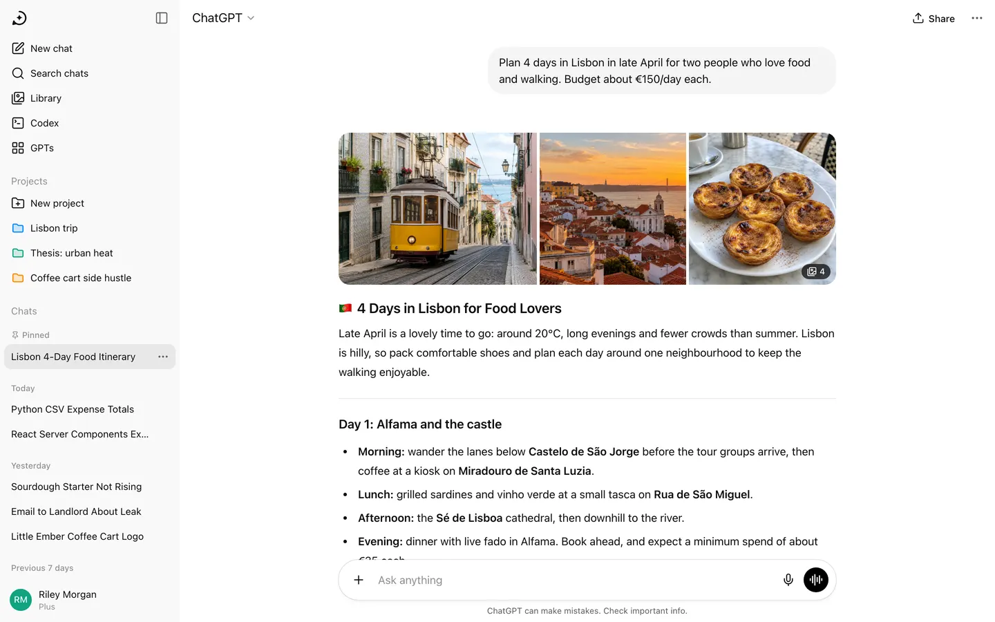
ChatGPT Clone (Web)
WebChatGPT's web app with a real AI inside: streamed answers, code blocks, image generation and PDF summaries.
- View template
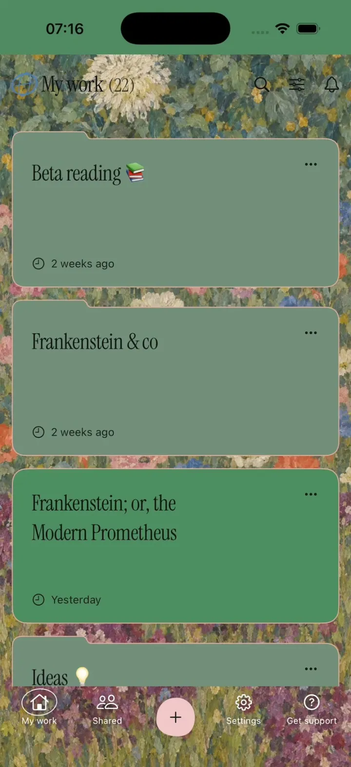
Ellipsus
iOSEllipsus's new writing app: a painted My work home, live word count, GIF replies, red and green diffs, Merge.
- View template
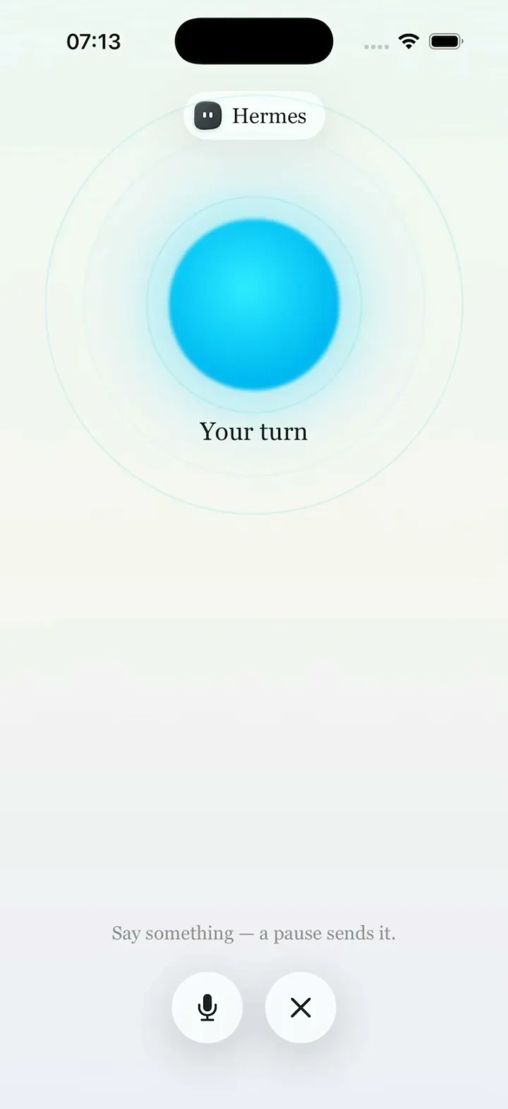
Hermes Agent
iOSHermes Agent's iPhone app: a breathing Live Mode orb, routines to Discord, one-tap skills, a Midnight theme.
- View template
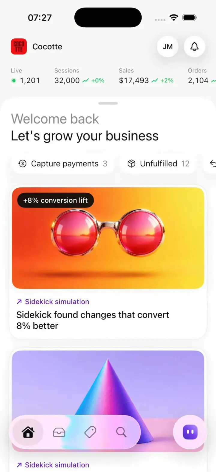
Shopify Admin
iOSShopify's rebuilt app: drag down for sales, tap morphing risk pills and buttons, catch first-order coins.