ChatGPT Clone (Web)
AI chat app · built by the Vibecode team
It opens on ChatGPT's familiar home, “What’s on your mind today?”, with a sidebar of projects and chats grouped by Today, Yesterday and the past week. Ask anything and a real GPT model streams the answer in markdown, with copyable code blocks, tables and maths, and the model picker switches between Auto, Instant, Thinking and Pro. Ask for a picture and it draws one with GPT Image, attach a PDF and it summarises it, and web search answers come with source pills. Chats, titles, images and settings are saved for each visitor, with search, share links, dark mode and a phone layout with a slide-out drawer.
- Web app
- Built in 7 prompts
- Free to remix
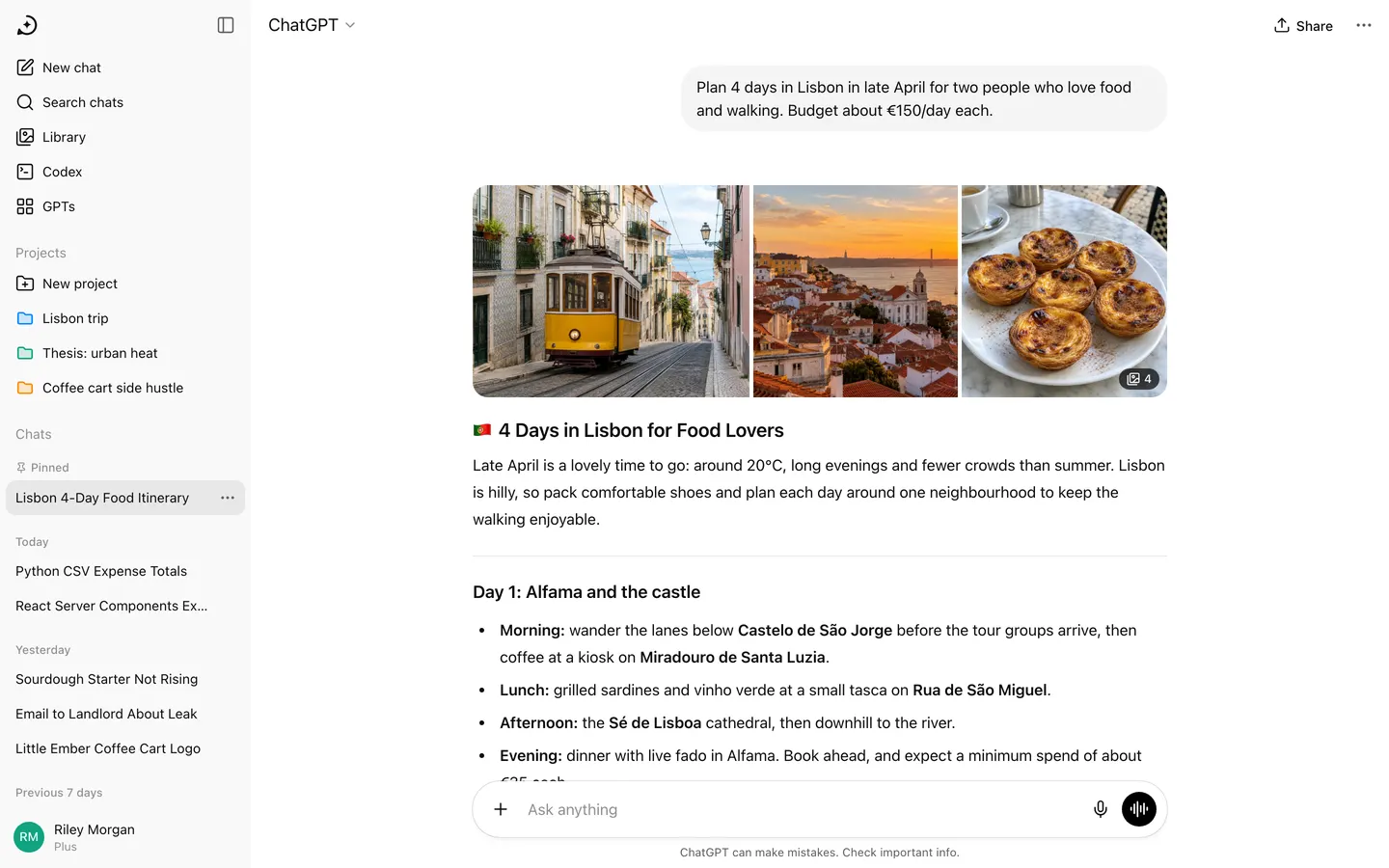
Remix copies the working app into your account for free, exactly as we built it. It runs in your browser.
The prompt that builds it
We built ChatGPT Clone (Web) in 7 prompts. Here they are folded into one, so a single paste into a new app builds the finished version.
Prompt · 6,598 words
Build a pixel-faithful web clone of ChatGPT (chatgpt.com) in its current design, using its real name, look and short interface words: a React web app named "ChatGPT" with a real AI behind it. Seeded demo conversations make it look full on first open, and every new message gets a real streamed answer from a GPT model through the project's proxied OPENAI_API_KEY. People and data are fictional. It is an unofficial demo clone: no log-in screens, no official OpenAI logo, and original wording for the plan cards. Match the reference screenshots as closely as possible: layout, spacing, typography, colours, icons, menus, modals, animations and every visible state.

Design references (the original screenshots are not included; build from these descriptions):
- Reference (Home sidebar): empty state with the full left sidebar, chat history, profile row (light)
- Reference (Plus menu): the composer "+" menu open
- Reference: the model picker dropdown under "ChatGPT ▾"
- Reference: a long answer with headings, numbered and bulleted lists, horizontal rules, and the message action row
- Reference: user bubble, answer with bold/italic text, small grey citation pills, and a markdown table
- Reference: dark theme: sidebar, header, user bubble, an answer with a 3-image strip and "4" image-count badge
- Reference: header "Share" button and "⋯" chat menu open (Pin chat, Archive, Report, Delete)
- Reference: share modal with preview card and Copy link / X / LinkedIn / Reddit, plus the green "Link copied!" toast
- Reference: "Search chats" modal with date groups
- Reference: Settings modal, General tab
- Reference: profile menu opened from the bottom-left profile row
- Reference: the images/library page layout
- Reference: "Share feedback" modal after thumbs-down
- Reference: "Upgrade your plan" full-screen modal (Free / Go / Plus / Pro)
- Reference: Settings modal in dark theme
- Reference: Temporary Chat empty state
- Reference: "Delete chat?" confirm dialog
- Reference: today's code block style: rounded container, "</> Python" header, wrap and copy icons, syntax colours
- Reference: today's table, bullets with bold labels, inline code pills, and action icons
The refs show a fictional user "Alex Smith"; our user is "Riley Morgan" (see data below). Ignore the dashed user bubble in ref 19 (that is temporary-chat styling; normal user bubbles are solid).

## Stack and structure
- Use the existing webapp (Vite + React + TypeScript + Tailwind) and the Hono backend on Bun (keep `import "@vibecodeapp/proxy"` first so the proxied keys in backend/.env work; read the vibecode-apis, database-auth and upload-assets skills first; never put a key in the frontend). Everything is stored in the database (see "Real AI and data" below); only theme, accent and sidebar state live in localStorage.
- react-router routes: `/` new chat, `/c/:chatId` conversation, `/library`, `/gpts`, `/g/:gptId` chat with a GPT, `/codex`, `/project/:projectId`, `/share/:chatId` (public read-only shared copy). Deep links must work on reload.
- Markdown: react-markdown + remark-gfm (tables, task lists, strikethrough) + remark-math/rehype-katex (math) + a syntax highlighter (highlight.js or Shiki) for code. Rendering must work progressively while text streams (an unfinished ``` fence already renders as a code block). "$" is always plain text (money): configure remark-math with `singleDollarTextMath: false`, convert `\( … \)` to inline `$$ … $$` and `\[ … \]` to display maths before rendering, and write all seed maths that way.
- Icons: lucide-react, 20px, stroke 1.75, unless noted. Logo: do not use the official OpenAI logo. Draw an original single-colour mark as an inline SVG Logo component (an open speech-bubble ring with a four-point spark in its centre, currentColor) in the place and size of the real one. The X, LinkedIn and Reddit share buttons use generic icons, not those companies' logos.
- Fonts: the real ChatGPT system stack: `ui-sans-serif, -apple-system, system-ui, "Segoe UI", Helvetica, "Apple Color Emoji", Arial, sans-serif`; code: `ui-monospace, SFMono-Regular, "SF Mono", Menlo, Consolas, "Liberation Mono", monospace`.
- Page title "ChatGPT"; meta description "Unofficial ChatGPT clone for demo purposes. Not affiliated with OpenAI." Favicon: your mark (black on white). og:title "ChatGPT", og:image a 1200x630 PNG with your white mark and the white "ChatGPT" wordmark (system sans-serif, about 96px, weight 600) to its right, the pair centred on black. No Vibecode branding anywhere (title, favicon, share image, footer).
- Build it in small source files (one component per file, data in its own files). Build in this order and get a first version running before polishing: 1) theme tokens + app shell (sidebar, header, main column, composer); 2) seed data files; 3) markdown renderer, code block, table, math, image strip; 4) database, owner middleware and chat API; 5) conversation view + streaming client; 6) model picker, + menu, tool pills, attachments; 7) message actions, edit, regenerate, feedback, share modal + /share page; 8) search modal, chat menus, rename/pin/archive/delete, temporary chat; 9) settings modal, profile menu, upgrade modal; 10) Library, GPTs, Projects, Codex pages; 11) phone layout; 12) generate the demo images; 13) run it and fix every console error and warning.

## Design tokens (match the refs)
Light theme:
- main background #ffffff; sidebar #f9f9f9; sidebar row hover #efefef; active (current chat) row #e8e8e8
- text primary #0d0d0d; secondary #5d5d5d; tertiary/placeholder #8f8f8f
- dividers/borders #e5e5e5; table rules #e5e5e5
- user bubble #f4f4f4; inline code background #ececec; code block container #f4f4f4
- composer: #ffffff, radius 28px, shadow exactly `0 4px 4px 0 rgba(0,0,0,0.04), 0 0 1px 0 rgba(0,0,0,0.62)`
- primary circular button (send/voice): #000000 with white icon; disabled send #d7d7d7
- unread/blue dot and tool pills #0285ff (pill background rgba(2,133,255,0.10))
- tooltip: #0d0d0d background, white 12px text, radius 8px, 6px 8px padding
- popover/menu: #ffffff, radius 16px, 1px border rgba(13,13,13,0.08), shadow `0 10px 30px rgba(0,0,0,0.12)`, 6px inner padding, rows 36px with radius 10px hover #f3f3f3
- modal overlay rgba(0,0,0,0.5) light / rgba(0,0,0,0.65) dark; modal radius 16px (share modal 24px)
- toast: green #10a37f pill, white 14px text, check-circle icon, top-centre, 12px from top
- danger red #e02e2a (Delete buttons and menu items)
- "Upgrade to Plus" purple #6b6bf0; POPULAR badge text #6b6bf0 on #ecebff
Dark theme (System / Dark / Light setting, default System):
- main #212121; sidebar #181818; row hover #242424; active row #2a2a2a
- text #ececec; secondary #afafaf; tertiary #8f8f8f; borders rgba(255,255,255,0.10)
- user bubble #303030; composer #303030 (no shadow, 1px border rgba(255,255,255,0.06)); code block #181818; inline code #424242
- primary circular button #ffffff with black icon; popovers #353535 with border rgba(255,255,255,0.08)
Type and spacing:
- answer text 16px / 28px; paragraphs 12px apart; h1 24px/600, h2 20px/600, h3 18px/600 (headings often start with an emoji in answers, like the refs), 24px above and 8px below headings
- lists: 24px indent, 6px between items, numbered lists with semibold numerals; horizontal rules 1px #e5e5e5 with 24px vertical margin
- inline code: 14px mono weight 500, 2px 6px padding, radius 6px
- sidebar rows 14px/20px, 36px tall, 10px horizontal padding, radius 10px, 8px icon gap; section labels ("Projects", "Chats") 14px #8f8f8f, 20px above
- header 52px tall; model picker button 18px "ChatGPT" + 16px chevron, padding 6px 10px, radius 10px, hover #f3f3f3
- empty-state heading 28px/34px weight 400, 24px above the composer
- conversation column max-width 768px, centred in the main area, 24px side padding
- spacing scale 4/8/12/16/24/32/40; radii 6/10/16/24/28

## Layout: desktop (1440x900)
Sidebar (260px wide, full height, #f9f9f9, no right border):
- Top row (52px): your mark (24px, button that starts a new chat) on the left; "Close sidebar" icon button (lucide PanelLeft) on the right, tooltip "Close sidebar".
- Nav rows: "New chat" (SquarePen) with shortcut hint "⇧⌘O" shown on hover in #8f8f8f; "Search chats" (Search) with "⌘K" on hover; "Library" (Images icon); "Codex" (a terminal-in-circle icon: lucide SquareTerminal or CircleChevronRight); "GPTs" (LayoutGrid / four-circles icon like ref 01's Apps row).
- "Projects" section: "New project" row (FolderPlus), then project rows with a coloured folder icon: "Lisbon trip" (blue #0285ff), "Thesis: urban heat" (green #10a37f), "Coffee cart side hustle" (orange #ff8a00).
- "Chats" section: history grouped under small labels "Today", "Yesterday", "Previous 7 days", "Previous 30 days" (12px #8f8f8f). Titles are single-line with ellipsis. The current chat row is highlighted #e8e8e8. Hovering a row shows a "⋯" button on its right (and on the active row always). Pinned chats appear in a "Pinned" group at the very top of Chats with a small pin icon.
- Row "⋯" menu: "Share", "Rename", "Move to project ›" (submenu listing projects + "New project"), "Pin chat" / "Unpin chat", "Archive", "Delete" (red). Rename turns the row into an inline input (Enter saves, Esc cancels).
- The list area scrolls independently; the profile row stays pinned at the bottom.
- Bottom profile row (64px, top border none): avatar = 32px circle with initials "RM" in white on #10a37f; name "Riley Morgan" (14px) with "Plus" under it (12px #8f8f8f). Clicking opens the profile menu (ref 11) ABOVE the row: header with avatar, "Riley Morgan" and "@rileymorgan" (12px grey); divider; "Upgrade plan" (Sparkles), "Personalization" (SmilePlus/CircleUser), "Settings" (Settings); divider; "Help ›" (LifeBuoy; submenu "Help center", "Release notes", "Terms & policies", "Keyboard shortcuts"). There is no "Log out" item and no log-in or log-out screen anywhere.
- Collapsed sidebar: clicking "Close sidebar" animates the width from 260px to a 52px icon rail (200ms ease): rail shows the logo (hover turns it into an "Open sidebar" icon), New chat, Search, Library, Codex, GPTs icons with tooltips, and the avatar at the bottom. State persists.

Header (52px, over the main area, background same as main):
- Left: model picker button "ChatGPT ▾" (when a non-Auto mode is selected, show it after a space in #5d5d5d, e.g. "ChatGPT Thinking ▾").
- Right on the empty state: "Turn on temporary chat" icon button (a dashed circle icon, tooltip "Turn on temporary chat").
- Right inside a conversation: "Share" button (Upload icon + "Share", 14px, radius 10px, hover #f3f3f3) and a "⋯" button opening the chat menu (ref 07): "Pin chat", "Archive", "Report", "Delete" (red, Trash2 icon). No group-chat items.
- A soft bottom fade/border appears under the header only when the conversation is scrolled.

Model picker (ref 03, popover 320px under the button, rows 56px: title 14px #0d0d0d, description 12px #8f8f8f, check icon on the selected row):
- "Auto" — "Decides how long to think" (default, checked)
- "Instant" — "Answers right away"
- "Thinking" — "Thinks longer for better answers"
- "Pro" — "Research-grade intelligence" with a small outline "Upgrade" pill on the right (Plus users can't use Pro; clicking it opens the Upgrade modal)
- divider, then "Legacy models ›" opening a side submenu: "GPT-5.6", "GPT-5.4 mini".
Selecting a row closes the menu and updates the header label. The choice is saved per chat.

Empty state (`/`): heading centred horizontally, with heading + composer sitting slightly above vertical centre (heading baseline about 35% down, composer about 45% down, as in ref 01). First load shows "What’s on your mind today?"; each later New chat picks one of "Ready when you are.", "What can I help with?", "Where should we begin?", "What’s on the agenda today?", "Hey, Riley. Ready to dive in?". No suggestion cards. No footer text on the empty state.

Composer (centred under the heading on the empty state; pinned to the bottom of the conversation view with the footer line "ChatGPT can make mistakes. Check important info." in 12px #5d5d5d centred 8px below it):
- Row: "+" button (36px circle, Plus icon, hover #f3f3f3, tooltip "Add files and more"), the auto-growing textarea (placeholder "Ask anything", 16px, grows up to 40% of the viewport height then scrolls), then on the right a mic button (Mic icon, tooltip "Dictate") and the 36px black voice button (AudioLines icon, tooltip "Use voice mode"). As soon as there is text or an attachment, the voice button becomes the black send button (ArrowUp icon, tooltip "Send prompt"). While a reply streams it becomes a black stop button (white filled square, tooltip "Stop streaming"), which stops the stream and keeps the partial answer.
- Enter sends, Shift+Enter adds a new line, empty prompts can't be sent.
- "+" menu (ref 02, popover 240px opening below the composer on the empty state and above it in a conversation): "Add photos & files" (Paperclip); divider; "Create image" (ImagePlus); "Thinking" (Lightbulb); "Deep research" (Telescope); "Web search" (Globe); "Shopping research" (ShoppingBag); "More ›" (Ellipsis; submenu "Study and learn" (BookOpen), "Agent mode" (MousePointer2), "Canvas" (PenLine)).
- Choosing a tool adds a pill inside the composer next to "+": blue text #0285ff with the tool's icon on a rgba(2,133,255,0.10) background, radius 9999px, 32px tall; hovering the pill swaps its icon for an × that removes it. Labels: "Image", "Thinking", "Research", "Search", "Shopping", "Study", "Agent", "Canvas". The placeholder changes with the tool: Image "Describe or edit an image", Research "Get a detailed report", Search "Search the web", Shopping "Find the best products", others "Ask anything".
- "Add photos & files" opens a real file picker (images, PDF, txt, md, csv, docx). Attachments show above the textarea inside the composer: images as 56px rounded-12px thumbnails, other files as a 56px-tall chip with a coloured file-type square (PDF red #fa423e with a white document icon, others blue), file name (truncated) and type label ("PDF", "Document", "Spreadsheet"); each has an × on hover. Sent attachments render above the user bubble in the conversation.
- Dictate: clicking the mic starts the browser SpeechRecognition (webkitSpeechRecognition); the composer shows a live waveform made of thin bars, a timer, an × (cancel) and a ✓ (insert transcript). If unsupported, show a toast "Dictation isn't supported in this browser."
- Voice mode: clicking the black voice button opens a full-screen overlay (main colour background) with a large animated orb in the centre (soft sky-blue/white radial gradients that slowly drift and breathe; it scales with mic volume when permission is granted), status text "Listening…" / "Speaking…", and two round buttons at the bottom: mic on/off and × close. It listens with SpeechRecognition, sends what was said as a message in the current chat, and reads the reply aloud with speechSynthesis.

## Conversation view (`/c/:chatId`)
- Column max 768px. User messages: right-aligned bubble #f4f4f4, radius 18px (24px when multi-line), padding 10px 16px, max-width 70%, 16px/24px text, preserves line breaks. Hovering a user message shows two small icon buttons under the bubble on the right: Copy and Edit message (Pencil).
- Assistant messages: no bubble and no avatar, full column width, rendered markdown.
- Action row under every assistant message (icons 18px in 32px buttons, #5d5d5d, hover background #f3f3f3, tooltips): Copy ("Copy" → check icon + "Copied!" for 2s), Good response (ThumbsUp; fills when chosen), Bad response (ThumbsDown; fills and opens the feedback modal), Share (Upload; opens the share modal), Try again (RefreshCw), More actions (Ellipsis: "Read aloud" using speechSynthesis, "Branch in new chat" which copies the chat up to this message into a new chat titled "Branch · <title>", and a disabled time line like "Today, 9:41 AM"). Always visible on the last assistant message, visible on hover for earlier ones.
- Try again re-streams a different answer and adds a version switcher "‹ 2/2 ›" at the left of the action row; arrows switch versions.
- Edit message turns the user bubble into a full-width rounded textarea with "Cancel" (outline pill) and "Send" (black pill); sending replaces everything after it with a new streamed answer and adds a "‹ 2/2 ›" switcher under the user bubble.
- Sending: the user bubble appears at once and the view scrolls so it sits near the top; a 12px black dot pulses (scale 0.8→1, 1s loop) where the answer will start until the first token arrives; the answer then streams in with markdown rendering live, and auto-scroll follows only while the user is at the bottom.
- A round 32px "scroll to bottom" button (ArrowDown, white, 1px border, soft shadow) appears centred above the composer whenever the user is scrolled up (refs 05, 06).
- Thinking mode (header mode "Thinking" or the Thinking pill): before the answer, show a shimmering grey "Thinking" label (gradient sweep animation) with the streamed reasoning summary; when the answer starts, it becomes "Thought for Ns ›" with the real elapsed seconds, which expands to a grey 14px reasoning summary with a 2px left border.
- Image results ("Image" pill, or a prompt that asks for an image, logo, picture, poster or illustration): a 512px-wide square card with radius 24px showing "Creating image" with a soft animated placeholder while the image generates, then the image sharpening from a blur and the label "Image created" above it; hovering the image shows Download and Copy icons in the corner; clicking opens a lightbox.
- Search pill replies show small grey citation pills after sentences (11px #5d5d5d on #f4f4f4, radius 9999px, e.g. "lonelyplanet.com +1"), like ref 05.
- Code blocks (ref 19): container #f4f4f4 (dark #181818), radius 24px, no border; header row 44px with a "</>" Code icon and the language name ("Python") in 13px weight 500 on the left, and on the right a wrap-lines toggle icon and a Copy icon (tooltip "Copy code" → "Copied"); code 13.5px/22px mono with 16px padding, horizontal scroll unless wrap is on; syntax colours like ref 19 (keywords magenta #b5267b, functions/modules purple #6f42c1, strings green #188038, numbers #b45309, comments grey #8f8f8f italic; in dark mode use a matching dark palette).
- Tables (ref 20): full column width, no outer border, header row 14px weight 600 with a 1px bottom rule, body rows 14px/22px with 1px #e5e5e5 rules, 10px vertical cell padding; a column is right-aligned only when the markdown asks for it (`---:`) or every body cell in it is a number or money amount, otherwise left-aligned, and header cells follow their column; horizontal scroll on overflow.
- Image strip (ref 06): up to 3 images in a row with 4px gaps, the group has 16px outer radius, the last tile shows a small dark pill "▣ 4" when there are more; click opens a lightbox with arrows.
- Math renders with KaTeX (inline and display).
- Streaming stop keeps the partial text. Every new or edited chat is saved immediately (store first, then UI updates).

New chats show "New chat" until their real title fades in after the first reply (see "Real AI and data").

## Modals and menus
- Search chats (⌘K or the sidebar row; ref 09): 680px wide, top at 18vh, radius 16px; an input row "Search chats..." with an × close; a highlighted "New chat" row (SquarePen); then chats grouped "Today", "Yesterday", "Previous 7 days", "Previous 30 days" with a MessageCircle icon and title. Typing filters by title and message text and shows the matching line as a grey snippet with the match in bold; nothing found shows "No results". ↑/↓ move the highlight, Enter opens, Esc closes.
- Share modal (ref 08): 600px, radius 24px; the chat title in 28px semibold with an × on the right and a divider; a preview card (radius 16px, 1px border) that renders the first user message bubble and the start of the answer with the real Markdown renderer (headings, bold, code blocks, tables, images) at about 85% scale, clipped with a soft white (dark: #212121) fade at the bottom, and the "ChatGPT" wordmark bottom-right; below, four 60px black circular buttons with white icons and 13px labels: "Copy link", "X", "LinkedIn", "Reddit". Copy link copies `<origin>/share/<chatId>` and shows the green toast "Link copied!"; X/LinkedIn/Reddit open their share intents with the link in a new tab.
- Shared page `/share/:chatId` (public, read-only, read from the API): a slim header with only your mark + "ChatGPT", a centred notice "This is a copy of a conversation between ChatGPT & Anonymous." with a "Report conversation" link, a bottom bar "Continue this conversation" (for someone else's chat it makes a copy for the visitor), and the footer line "Unofficial ChatGPT clone for demo purposes. Not affiliated with OpenAI." in 12px grey.
- Feedback modal (ref 13): title "Share feedback" + ×; chips "Incorrect or incomplete", "Not what I asked for", "Slow or buggy", "Style or tone", "Safety or legal concern", "Other" (selected chip = black outline + #f3f3f3 background); a textarea "Share details (optional)"; a grey note box "Your conversation will be included with your feedback to help improve ChatGPT. Learn more"; "Submit" (grey disabled until a chip is chosen, then black). Submit saves the feedback, closes, and shows the toast "Thank you for your feedback!".
- Delete chat (ref 18): "Delete chat?" / "This will delete **<title>**." / "Visit settings to delete any memories saved during this chat." (settings is an underlined link) / "Cancel" (outline pill) and "Delete" (red pill). Deleting navigates to a new chat and shows the toast "Chat deleted".
- Report: a small modal "Report conversation" with radio reasons ("Violence & self-harm", "Sexual content", "Bullying & harassment", "Spam, fraud & deception", "Privacy violation", "Something else") and "Submit" → toast "Thanks for your report".
- Archive moves the chat out of the sidebar (toast "Chat archived" with an "Undo" link); archived chats are listed in Settings → Data controls → Archived chats → Manage (each with Unarchive and Delete icons and a human date like "October 28, 2026").
- Temporary chat (ref 16): the header icon toggles it (filled dashed-circle when on, tooltip "Turn off temporary chat"); the empty state shows "Temporary Chat" and "This chat won't appear in your chat history, and won't be used to train our models."; in light mode the composer turns dark (#303030, white text, white send button); the footer reads "For safety, we may keep a copy of this chat for up to 30 days." Temporary chats are never saved to the store.
- Settings modal (refs 10, 15): 680x600px, radius 16px; left nav 180px (#f9f9f9 light / #1f1f1f dark) with an × at the top and tabs with icons: General (Settings), Notifications (Bell), Personalization (SmilePlus), Apps (LayoutGrid), Data controls (Database), Security (ShieldCheck), Account (CircleUser); the active tab has a #ececec background. Right pane: tab title 18px with a divider, then 56px rows (label left, control right: value text + ChevronDown opening a small dropdown), rows separated by 1px dividers. Every control works and saves to the store:
  - General: a dismissible card "Secure your account" / "Add multi-factor authentication (MFA), like a passkey or text message, to help protect your account when logging in." with a "Set up MFA" outline button; Appearance (System / Dark / Light, switches the theme live); Accent color (a dot + Default / Blue / Green / Yellow / Pink / Orange / Purple; tints the user bubble, tool pills and focus rings); Language (Auto-detect + a list); Spoken language (Auto-detect, helper text "For best results, select the language you mainly speak. If it's not listed, it may still be supported via auto-detection."); Voice ("▶ Play" previews with speechSynthesis | "Spruce ▾" with Arbor, Breeze, Cove, Ember, Juniper, Maple, Sol, Spruce, Vale); "Show additional models" toggle; at the bottom, in 12px grey: "Unofficial ChatGPT clone for demo purposes. Not affiliated with OpenAI."
  - Notifications: "Responses" (Push), "Group chats" (Push), "Tasks" (Push, Email), "Projects" (Email), "Recommendations" (Push, Email), "Usage" (Push, Email), each with a one-line grey description.
  - Personalization: "Base style and tone" (Default, Professional, Friendly, Candid, Quirky, Efficient, Nerdy, Cynical) with the description "Set the style and tone of how ChatGPT responds to you. This doesn't impact ChatGPT's capabilities."; "Characteristics": Warm, Enthusiastic, Headers & Lists, Emoji (More / Default / Less); "Custom instructions" textarea (placeholder "Additional behavior, style, and tone preferences"); "About you": Nickname "Riley", Occupation "Product designer", More about you "I live in Portland, ride a bike to work, and cook a lot on weekends."; "Memory": toggles "Reference saved memories" and "Reference chat history", and a "Manage" button opening "Saved memories" (search box + 6 fictional memories, each deletable with a confirm, toast "Memory deleted").
  - Apps: "Enabled apps" list (Google Drive, GitHub, Figma, Notion with their names and a generic coloured square icon) each with a "Connect"/"Connected" toggle button that saves.
  - Data controls: "Improve the model for everyone" (On ›, toggles); "Shared links" (Manage, lists chats you've shared with Copy and Delete); "Archived chats" (Manage); "Archive all chats" (Archive all, confirm); "Delete all chats" (red outline "Delete all", confirm); "Export data" (Export, downloads a real JSON file of all chats); "Restore example chats" (Restore, puts the demo chats back).
  - Security: "Multi-factor authentication" with an "Authenticator app" toggle and "Passkeys" (Add). No log-out rows.
  - Account: Name "Riley Morgan", Email "riley.morgan@example.com", a plan card "ChatGPT Plus — Your plan auto-renews on December 3, 2026" with "Manage" (opens the Upgrade modal), "Delete account" (red outline, confirm that says it is disabled for the demo account).
- Upgrade modal (ref 14 layout): full-screen sheet (#f9f9f9 light / #212121 dark) with × top-right, "Upgrade your plan" (28px), a Personal | Business segmented toggle, and four cards laid out like ref 14 with the real plan names and prices: Free $0, Go $8 (black "Upgrade to Go"), Plus $20 with a "POPULAR" badge, a purple 1px border and faint purple gradient (for Riley its button reads "Your current plan", disabled outline), and Pro $200 (black "Upgrade to Pro"); write your own short taglines, feature lists and footnotes. The Business tab shows Free and Business $30 per user per month. Upgrade buttons show the toast "Checkout isn't connected in this demo." Escape and × close it.
- Keyboard shortcuts modal (Help → Keyboard shortcuts or ⌘/): "Open new chat ⇧⌘O", "Focus chat input ⇧Esc", "Copy last code block ⇧⌘;", "Copy last response ⇧⌘C", "Toggle sidebar ⇧⌘S", "Delete chat ⇧⌘⌫", "Search chats ⌘K", "Show shortcuts ⌘/", with key caps; all of these shortcuts actually work.
- All popovers: fade + scale from 0.96 in 120ms from their trigger; modals: overlay fade 150ms and panel scale 0.98→1; Esc and outside clicks close; focus is trapped in modals.

## Pages
- Library (`/library`, ref 12 layout): title "Library" (28px semibold); a composer-style bar "Describe a new image" (ImagePlus icon left, mic and send right) that starts a new chat with the Image tool; "My images" grid of all images from chats + extra demo images: 4 columns, 4px gaps, square tiles with 12px radius, hover shows a dark gradient with the prompt; click opens a lightbox (big image, prompt text, "Download", "Copy prompt", "Go to chat"). Empty state "No images yet" with a short line and a "Create an image" button.
- GPTs (`/gpts`): centred 768px column; title "GPTs" (48px bold), subtitle "Discover and create custom versions of ChatGPT that combine instructions, extra knowledge, and any combination of skills."; a rounded search field "Search GPTs"; category tabs "Top Picks", "Writing", "Productivity", "Research & Analysis", "Education", "Lifestyle", "Programming" (underline on active); "Featured" + "Curated top picks from this week" as 4 cards in a 2x2 grid (64px rounded icon, name semibold, two-line description, "By <creator>"); "Trending" + "Most popular GPTs by our community" as a numbered list 1-6 in two columns; "By ChatGPT" + "GPTs created by the ChatGPT team": "Image Generator", "Data Analyst", "Creative Writing Coach", "Coloring Book Hero", "Laundry Buddy", "Tech Support Advisor". Fictional community GPTs (creators fictional): "Trip Planner Pro" (by Wayfarer Labs), "Résumé Coach" (by Careerline), "Recipe Remix" (by Pantry Studio), "Study Buddy" (by Lumen Learning), "SQL Sidekick" (by Querycraft), "Garden Planner" (by Greenhouse Co), "Pitch Deck Doctor" (by Northstar), "Language Partner: Spanish" (by Hablamos). Tabs filter the lists; search filters by name/description. Clicking a GPT opens a detail modal (big icon, name, "By <creator>", rating "4.6 ★ (12K+)", "#2 in Productivity", "1M+ Conversations", four conversation-starter chips, black "Start Chat"). Start Chat goes to `/g/:gptId`, whose empty state shows the GPT icon (64px), name, "By <creator>", description and the four starters; the header shows the GPT name with a chevron.
- Projects (`/project/:projectId`): the coloured folder icon + project name (28px), a composer "New chat in <project>", tabs "Chats" | "Sources", the project's chats as rows (title, one-line grey snippet, short date like "Oct 28" right-aligned), "Sources" lists 2 fictional files with type icons. "New project" opens "Create project": name input (placeholder "Copenhagen Trip"), a colour and icon picker, category chips "Investing", "Homework", "Writing", "Travel", the line "Projects keep chats, files, and custom instructions in one place. Use them for ongoing work, or just to keep things tidy.", and "Create project" (disabled until a name is typed). New chats started inside a project belong to it.
- Codex (`/codex`): title "Codex" top-left; centred heading "What should we code next?"; a large rounded composer "Describe a task" with chips under the text area: repo "riley-morgan/recipe-box ▾", branch "main ▾", "1x ▾", plus "Ask" and "Code" buttons; tabs "Tasks" | "Code reviews" | "Archive"; a task list of 6 fictional tasks (title, "Nov 2 · riley-morgan/recipe-box", green "+45" red "−12" diff counts). "Code" adds a new task row that shows a shimmering "Working on it…" and turns into "Ready" with diff counts after 4 seconds.

## Seed data (fictional; timestamps are relative to the current date at runtime so the groups are always correct)
User: Riley Morgan, @rileymorgan, riley.morgan@example.com, plan Plus.
Write complete, high-quality markdown answers (at least 250 words for the rich chats, with real substance) for all 16 chats:
Today
1. "Python CSV Expense Totals" — user asks for a Python function that reads a CSV of expenses (date, category, amount) and returns sorted totals per category, plus a sample output table and edge cases. Answer: intro line; "### Python function" with a ~20-line Python code block (csv, defaultdict, Decimal); "### Example CSV input" with a csv code block; "### Sample output" table (Category | Total) with Food $55.50, Rent $1,000.00, Transport $20.50, Grand Total $1,076.00; "### 4 edge cases" bullets with bold labels and inline code; a closing "Note:".
2. "Lisbon 4-Day Food Itinerary" (project Lisbon trip) — user: "Plan 4 days in Lisbon in late April for two people who love food and walking. Budget about €150/day each." Answer: emoji heading, the 3-image strip (Lisbon images below, with "4" badge), Day 1-4 sections (Alfama, Baixa/Chiado, Belém, LX Factory) with bullets naming real public places, a cost table (Item | Approx. per day), tips list, and an offer to make a map.
3. "React Server Components Explained" — headings, a TSX code block, a Client vs Server comparison table, a numbered list.
Yesterday
4. "Sourdough Starter Not Rising" (has a "Thought for 12s" block) — numbered troubleshooting, a feeding schedule table.
5. "Email to Landlord About Leak" — subject line + the email, then "Want me to make it firmer or shorter?".
6. "Little Ember Coffee Cart Logo" (project Coffee cart side hustle) — user asks for a logo for a coffee cart called "Little Ember"; the answer is an "Image created" card with the generated logo, then two lines of notes and three variation ideas.
Previous 7 days
7. "SQL for Monthly Churn" — a SQL code block, a result table (month, active, churned, churn %), explanation bullets.
8. "16-Week Half Marathon Plan" — a 16-row week-by-week table.
9. "Summarize Q3 Board Memo" — the user message carries a PDF attachment chip "Q3-board-memo.pdf" (PDF, 2.1 MB) for the fictional company "Northwind Bikes"; answer: summary bullets, a key-numbers table, risks list.
10. "Compound Interest Formula" — KaTeX display formula A = P(1 + r/n)^{nt}, a worked example, a small table.
11. "Urban Heat Island Sources" (project Thesis: urban heat) — Search-style answer with grey citation pills and a references list.
Previous 30 days
12. "Birthday Toast for My Sister"
13. "TypeScript Generic Constraint Error" — before/after TS code blocks.
14. "Low-Light Houseplants" — a table (plant, light, water, pet-safe).
15. "Cover Letter: Product Designer"
16. "Big Sur Weekend Packing List" — a task-list checklist.
Pin chat 2 by default. Library extras and GPT icons below.

Generated images: use `gpt-image-2.5-flare` through the project's proxied OPENAI_API_KEY (POST https://api.openai.com/v1/images/generations from a script in backend/ that imports "@vibecodeapp/proxy" first; run env to confirm the key). Make: Lisbon tram 28 on a steep street (1536x1024), Alfama rooftops at sunset (1536x1024), a plate of pastéis de nata (1024x1024), a fourth Lisbon miradouro view, the "Little Ember" coffee cart logo (flat vector mark, warm orange ember, cream background, 1024x1024), and for the Library: a watercolour fox in snow, an isometric tiny home office, a retro travel poster of Mars, a sourdough loaf on linen, a cozy reading nook with rain on the window; plus 14 flat, colourful GPT icons (no text, no people). No real people anywhere; if a person appears it must be AI-generated. Save them as optimised WebP under webapp/public/demo/ and reference them from the seed data.

## Phone layout (390x844)
- Header 52px: left a sidebar button (two horizontal lines, the lower one shorter), "ChatGPT ▾" next to it (17px, opens the model picker as a bottom sheet), right a New chat icon (SquarePen); the temporary-chat icon shows on the empty state.
- The sidebar becomes a drawer: slides in from the left (280ms, cubic-bezier(.2,.8,.2,1)), width min(85vw, 320px), full height, scrim rgba(0,0,0,0.35) that closes it on tap; choosing a chat or a page closes it.
- Empty state: heading at about 40% height; the composer is pinned to the bottom (12px side margins, safe-area padding).
- Conversation: 16px side padding, user bubbles max 85% wide, code blocks and tables scroll horizontally, the action row is always visible.
- The "+" menu, model picker and chat menus open as bottom sheets (radius 16px top, drag handle). Search, Settings, Share, Feedback, Upgrade and Create project open as full-height sheets; Settings shows the tab list first, then the chosen tab with a back chevron.
- No horizontal page overflow at 390px; every tap target is at least 40px.

## States
- Loading: sidebar and conversation skeleton rows (shimmer) while the API loads; images fade in when loaded.
- Empty: new chat, no search results, empty project ("No chats in this project yet"), no archived chats ("You have no archived conversations."), empty Library.
- Error: an inline assistant error block "Something went wrong while generating the response." with a "Retry" button when a reply fails, and an offline banner "You're offline. Check your connection." when navigator.onLine is false.
- All dates are human-readable ("Today, 9:41 AM", "Yesterday", "Oct 28", "October 28, 2026").

## Real AI and data
1. Database. Use the platform's standard database setup (Prisma, per the database-auth skill). Tables: Chat (id, ownerId, title, mode, legacyModel, projectId, gptId, pinned, archived, sharedAt, createdAt, updatedAt), Message (id, chatId, role, content as markdown, attachments JSON, images JSON, citations JSON, reasoning summary, thoughtSeconds, feedback, version fields for "Try again" and edits, createdAt), Project, Memory, Settings, Feedback. No login: on first visit the webapp creates a random owner id in localStorage and sends it as an `x-owner-id` header on every call; all rows are scoped to it, and a new owner gets a fresh copy of the 16 demo chats, projects, memories and settings (idempotent seeding, timestamps relative to now). Read and write through these APIs with React Query and optimistic updates (save first, then show the toast); keep only theme, accent and sidebar state in localStorage. Sidebar and conversation show the skeletons while loading.

2. Streaming replies. POST /api/chats/:id/messages calls the OpenAI Responses API (POST https://api.openai.com/v1/responses, `stream: true`) and streams Server-Sent Events to the browser; forward `response.output_text.delta` text and, in Thinking mode, `response.reasoning_summary_text.delta` into the "Thinking" block, with the real elapsed seconds in "Thought for Ns". Model map: Auto → gpt-6.1-terra, Instant → gpt-6-luna, Thinking → gpt-6.1-sol with reasoning effort "high" and summary "auto", Pro → gpt-6-astra, legacy "GPT-5.6" → gpt-5.6, "GPT-5.4 mini" → gpt-5.4-mini. Test every model id through the proxy with curl first; if one is rejected, map that mode to gpt-5.6 and say so. Send the whole conversation, plus a system message built per request: "You are ChatGPT, a helpful assistant. Current date: <weekday, Month D, YYYY>, <HH:MM> in <timezone> (the browser sends its timezone). Answer in Markdown and use headings, lists, tables and fenced code blocks with a language tag when they help." Append the user's Personalization settings (base style and tone, characteristics, custom instructions, occupation, more about you) and the saved memories when those toggles are on, and give the nickname as background only: "The user's name is Riley. Do not start answers with their name, and use it at most once in a long conversation, only when it adds warmth." Tell the model to write maths with \( \) and \[ \]. Inside a GPT chat, prepend that GPT's own instructions. "Stop streaming" aborts the upstream request and saves the partial answer. "Try again" and edits create new versions that stream the same way. Failures show the inline error block with Retry. Temporary chats stream but are never stored, and they ignore personalization, custom instructions and saved memories (a plain system prompt with only the date and the formatting rules).

3. Titles. After the first reply in a chat, generate a 3-6 word Title Case title with gpt-6-luna (no quotes, no trailing punctuation), save it, and update the sidebar row live with the fade-in. If the title call fails or the reply errors, fall back to the first 5-6 words of the first user message in Title Case; never list a chat that has no user message.

4. Images. When the Image pill is on, or the message asks to create, draw, generate or design an image, logo, picture, poster or illustration (decide with a quick gpt-6-luna yes/no call), call POST https://api.openai.com/v1/images/generations with model "gpt-image-2.5-flare" (1024x1024, or 1536x1024 when the prompt asks for wide/landscape/banner) while the "Creating image" blur animation plays; store the PNG with Vibecode Storage (upload-assets skill), save its URL on the message, show "Image created" with the image, and add it to the Library. Follow-up edits of the last image ("make it blue") use "gpt-image-2.5-sunburst" with the previous image.

5. Files. "Add photos & files" uploads to Vibecode Storage with a progress ring on the chip. Images go to the model as `input_image`. PDF, txt, md, csv and docx files get their text extracted on the backend (unpdf for PDF, mammoth for docx) and are sent as input text with the file name, so "Summarize this" works; the chip shows the real file name, type and size.

6. Web search. When the Search, Deep research or Shopping pill is on, call the Responses API with the built-in `web_search` tool (if the proxy rejects it, use Perplexity `sonar` through the proxy) and render the citations as the grey pills with the source domain, each linking to its page.

7. Dictation. The mic records with MediaRecorder and posts the audio to /api/transcribe, which calls gpt-4o-transcribe through the proxy; the transcript lands in the composer (keep the browser SpeechRecognition as the fallback).

8. Everything else reads and writes the database: new chat, rename, pin, archive/unarchive, delete, move to project, feedback, share links (the public read-only /share/:id page reads from the API), settings, memories, projects, GPT chats, export data, archive all, delete all and "Restore example chats".

9. The SQLite database file is committed to git: keep it empty of visitor data. Each visitor gets their own seeded copy of the demo chats on first visit.

Quality bar: it must look like the real ChatGPT, not a generic AI template: no purple-blue gradients, no emoji used as UI icons, no glassmorphism, no default-shadcn look; exact colours and spacing above; light and dark both polished.

Build it fully, run it, and fix every error. Then test it end to end: ask "What's today's date, and how many days are left until Christmas?" and check the answer uses today's real date; check that a code answer streams and copies, "Draw a watercolor lighthouse at dawn" makes an image that lands in the Library, a PDF upload gets summarised, Thinking shows "Thought for Ns", and chats, titles and images survive a reload. Deliver the complete app, not a plan.
More templates
All templates- View template
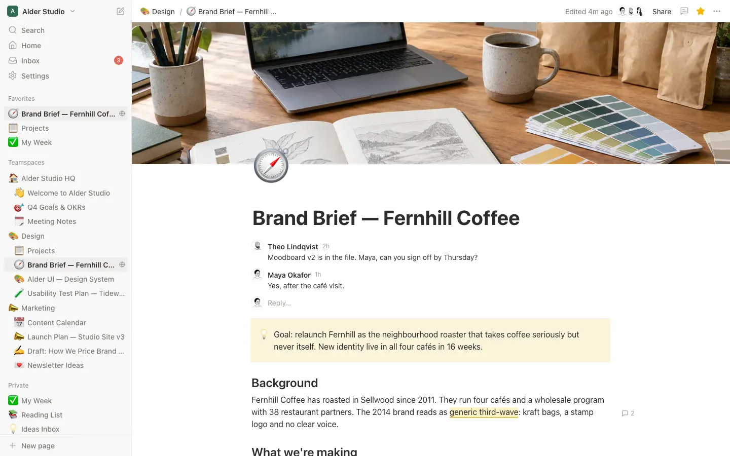
Notion Clone
WebNotion with a working block editor, / menu, inline comments, page history and four live database views.
- View template
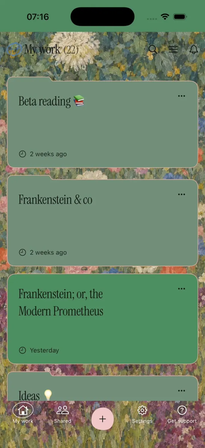
Ellipsus
iOSEllipsus's new writing app: a painted My work home, live word count, GIF replies, red and green diffs, Merge.
- View template
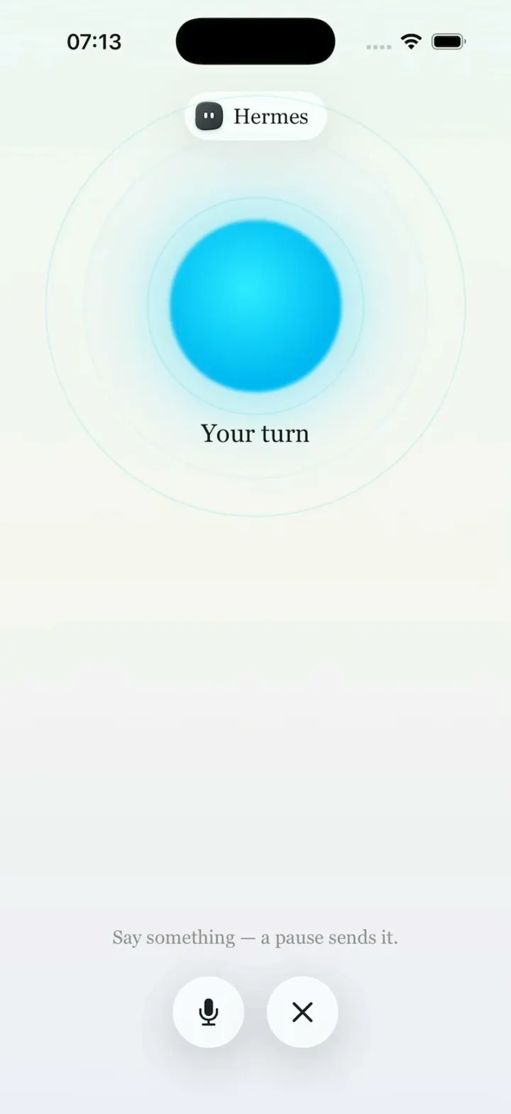
Hermes Agent
iOSHermes Agent's iPhone app: a breathing Live Mode orb, routines to Discord, one-tap skills, a Midnight theme.
- View template
Shopify Admin
iOSShopify's rebuilt app: drag down for sales, tap morphing risk pills and buttons, catch first-order coins.