Plasma Fold
Finance app · from our videos on X
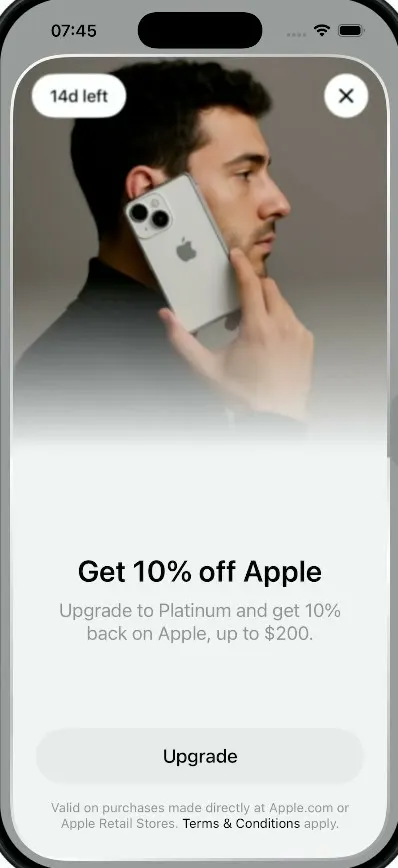
Plasma Fold recreates the Plasma money app's iPhone Duo campaign sheet. Tap the "Get 10% off Apple" banner and a half-height card slides up, then its photo half swings open around a hinge in 3D, blurring and darkening as it turns. Tap the photo and the panel folds back down onto a cover screen whose text fades into a progressive blur; tap the cover and it opens again. The sheet wears a polished aluminium rim like the phone it advertises, and the home screen behind it has the Spendable balance, Add money and Send, and the dark green Plasma card.
- iPhone · Swift
- Built in 3 prompts
- Free to remix
Remix copies the working app into your account for free, exactly as we built it. It runs in Vibecode's cloud iOS simulator, in your browser.
Watch the video on X@ios_app_builder · Oct 17, 2026The prompt that builds it
We built Plasma Fold in 3 prompts. Here they are folded into one, so a single paste into a new app builds the finished version.
Prompt · 1,259 words
Download/reference the app shown in this post and clone it exactly, including the iPhone visual design, layout, interactions, animations, typography, spacing, and all visible states. Make it functional and runnable in the simulator. Match the reference as closely as possible and include any interaction shown in the source. Reference: https://x.com/justinwiese/status/2111102276379275282.

Build a native SwiftUI iOS app named Plasma using Opus 5.5. This is the home screen of the Plasma money app plus its "foldable sheet": a promo sheet for the iPhone Duo campaign that is drawn like a little iPhone Duo and folds shut and open around a horizontal hinge like a book, demonstrated on iPhone (portrait, light mode). Do NOT put a fake handset frame inside the actual app; the simulator provides that. Use realistic deterministic fixture data so every screen is rich and usable without permissions or backend.

Observed video sequence (0-17s):
0-1.2s: home screen, static.
1.27s: the "Get 10% off Apple" promo banner is tapped; the home screen dims (black overlay fading to ~40%).
1.5-1.7s: the sheet slides up from the bottom in its FOLDED state: only the bottom half of the sheet is visible (the "cover"), showing the promo text.
1.73-1.95s: it unfolds: the top panel (the photo half) swings up from the hinge at the sheet's vertical middle like a book cover opening upwards, blurred and shaded while it turns, then lands flat and the photo sharpens.
1.95-3.8s: the full sheet is open (photo on top, text below).
3.8-4.9s: FOLD: the photo blurs, then the top panel rotates around the middle hinge towards the viewer and down (perspective 3D). At ~90 degrees it is just a thin silver metal edge at the hinge with a dark shadow below it; it keeps turning and lands flat on top of the bottom half, showing its back face (the cover screen). A dark gradient shade on the panel fades out as it lands.
4.9-7.0s: folded state holds: a half-height sheet whose cover shows "Get 10% off Apple" sharp, with the text below it progressively blurred.
7.0-9.5s: UNFOLD: the cover content blurs and a dark shade grows from its bottom edge as the panel lifts (its bottom edge rises towards the hinge), passes 90 degrees at the hinge (~7.8s), then the photo face rises above the hinge, blurred, lands flat and sharpens.
11.4-12.6s: fold again. 14.1-16.3s: unfold again.

Visual details: background #F2F2F2 (very light grey), SF Pro, black text, grey #8A8A8E secondary.

HOME SCREEN (top to bottom, 20pt side margins):
- Status bar 09:41.
- Top row: left a 44pt circle avatar with a magenta gradient (#FF2BD6 top-left to #C21BC9) and a white "J"; right two 44pt white circle buttons with black SF Symbols "building.columns.fill" and "chart.bar.fill".
- Centered "Spendable" (17pt, grey), "$2.16" (52pt, bold, black), then a light grey capsule pill containing a hollow grey ring icon, "$2.16" (grey, 17pt) and "chevron.up.chevron.down".
- Two equal capsules side by side, 54pt tall: "Add money" (black fill #1C1C1E, white text, soft shadow) and "Send" (white fill, black text).
- A horizontally paged promo carousel: card #DCDCDC, 18pt radius, ~78pt tall: "Get 10% off Apple" (17pt, black) and below "Upgrade to Platinum." (15pt, grey); on the right a photo of a hand holding a silver iPhone Duo (bottom-anchored, overflowing the card bottom edge); a small dark grey circle "xmark" top-right. The next card peeks in from the right edge. Two page dots below (first black, second grey).
- Plasma card: full width, ~210pt tall, 22pt radius, dark green-black diagonal gradient (#3B4A3E top-left, #1A1F1B centre, #0E0F0E bottom-right) with a subtle sheen. Top-left a white sunburst logo (circle of thin radial strokes) + "Plasma" (28pt, white). Bottom-left "$2.16" white + small green #34C759 dot; bottom-right "•••• 6838" + chevron.right, white.
- Floating bottom tab bar: white rounded rect (28pt radius) with 3 items: "Home" (house.fill, black, on a light grey selected pill), "Earn" (chart.bar.fill, grey), "Rewards" (a grey star-in-circle icon, grey).

THE SHEET (the hero):
- Size: inset 10pt from the screen's left/right edges and 8pt from the bottom, top at ~56pt below the top of the screen; corner radius ~54pt (concentric with the display). The whole sheet looks like an iPhone Duo: a 3pt polished-aluminium rim around the edge (linear gradient white -> #B8B8BC -> white -> #8E8E93), inner surface #F2F2F2.
- Hinge = the sheet's vertical middle. Top panel = upper half, bottom panel = lower half.
- Open (inner screen) layout: grab handle (36x5 grey capsule) centred at the top; white capsule "14d left" (17pt, black) top-left and a 44pt white circle with a black "xmark" top-right. The upper ~45% is a studio photo on a grey gradient (#8C8C8C at the top fading to the sheet's #F2F2F2 at the bottom): a man in profile looking right, dark curly hair, black turtleneck, holding a silver iPhone Duo (two big camera lenses, Apple logo) to his ear with his right hand; the photo bottom fades into the sheet. Lower half, centred: "Get 10% off Apple" (30pt, semibold, black), "Upgrade to Platinum and get 10% back on Apple, up to $200." (19pt, grey, 2 lines), a wide light grey capsule button "Upgrade" (#E6E6E8, 56pt tall, black 19pt text), fine print "Valid on purchases made directly at Apple.com or Apple Retail Stores. Terms & Conditions apply." (13pt, grey, with "Terms & Conditions" in black).
- Folded (cover screen): only the bottom half shows; its face (the back of the top panel) shows the same "Get 10% off Apple", subtitle, Upgrade button and fine print at the same positions, but everything below the title gets a progressive blur (sharp at the title, strongly blurred at the bottom), and the top corners are rounded like the bottom ones.
- Fold/unfold animation: the top panel is a two-sided view rotating 0 -> 180 degrees around the hinge line (rotation3DEffect on the X axis, anchored at the hinge, perspective ~0.6). Front = the photo half, back = the cover screen. While turning: the visible face blurs (radius up to ~20), a black shade (opacity up to ~0.7, strongest near 90 degrees) darkens it from the free edge, the aluminium rim stays visible as the panel's edge, and a soft shadow falls on the bottom half below the hinge. Fold ~1.0s, unfold ~1.3s, easeInOut, then the content sharpens over ~0.4s.
- Interactions: tapping the home banner opens the sheet (dim + slide up folded + auto-unfold). Tapping the open sheet's photo area (or swiping down on it) folds it. Tapping the folded cover (or swiping up on it) unfolds it. The X folds the sheet, slides it down and removes the dim; tapping the dimmed background does the same. Everything resets so the banner can be tapped again for a clean replay.

Generate the two photos (the man with the iPhone Duo; the hand holding a silver iPhone Duo for the banner) with an image model: run env, use the project's proxied OPENAI_API_KEY with https://api.openai.com/v1/images/generations and gpt-image-1, save them as assets. Use native SwiftUI animations, not static screenshots.

Build it in small source files, in this order: the home screen (header, Spendable balance, Add money / Send, promo carousel, Plasma card, floating tab bar), then the foldable sheet (rim, open layout, the two-sided top panel turning around the hinge, the progressive-blur cover, the gestures), then the two generated photos. Keep SwiftUI types simple, split complex view bodies, and get a first version compiling and running before polishing.

Build fully, run compile/build validation, resolve all errors, and launch in the web simulator. Prioritize fidelity to the reference and functional main interaction flow. Deliver complete implementation rather than a plan.
More templates
All templates- View template
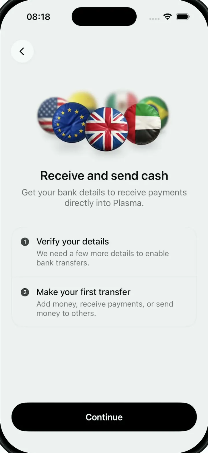
Plasma
iOSA money app onboarding screen whose hero is a turning 3D ring of puffy, glossy country-flag badges.
- View template
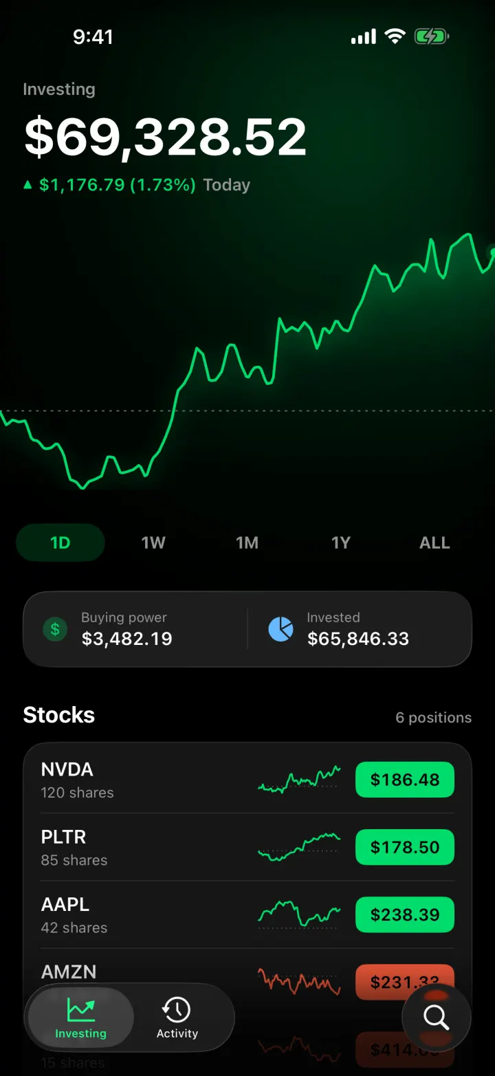
Ticker
iOSA Robinhood-style investing app with a scrubbable chart, candlesticks and a buy flow that ends in confetti.
- View template
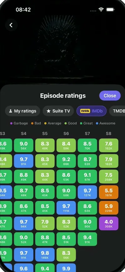
Suite TV
iOSA dark TV show tracker: tick off episodes, rate and react, see where a show fell apart, import your history.
- View template
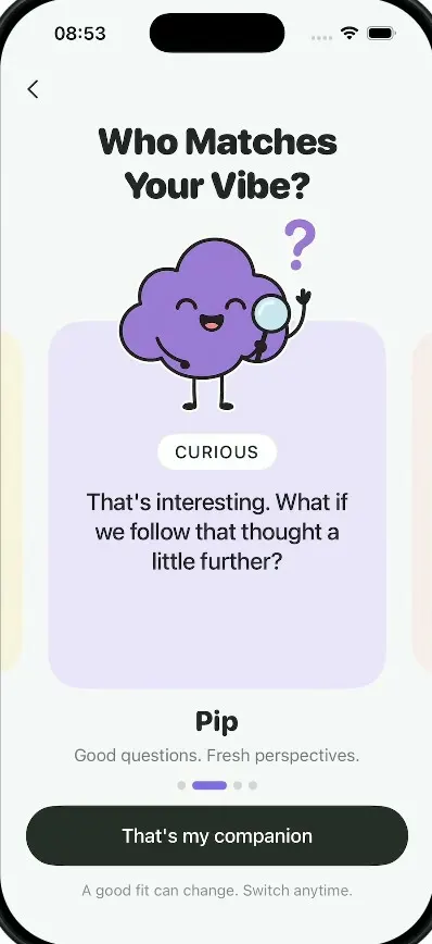
Milo
iOSAn AI companion onboarding: springy sticky notes, four cartoon companions, a rolling dial and a postage stamp.